
Many brand owners assume white background photography is easy. It’s just a product on a clean surface, right? Point the camera, add light, and you’re done.
If only it were that simple.
The truth is, white background photography looks effortless only when every detail has been carefully controlled. When it’s done right, the product feels crisp and dimensional. When it’s done wrong, it looks flat, cheap, and uninspired. And in e-commerce, that difference costs real money.
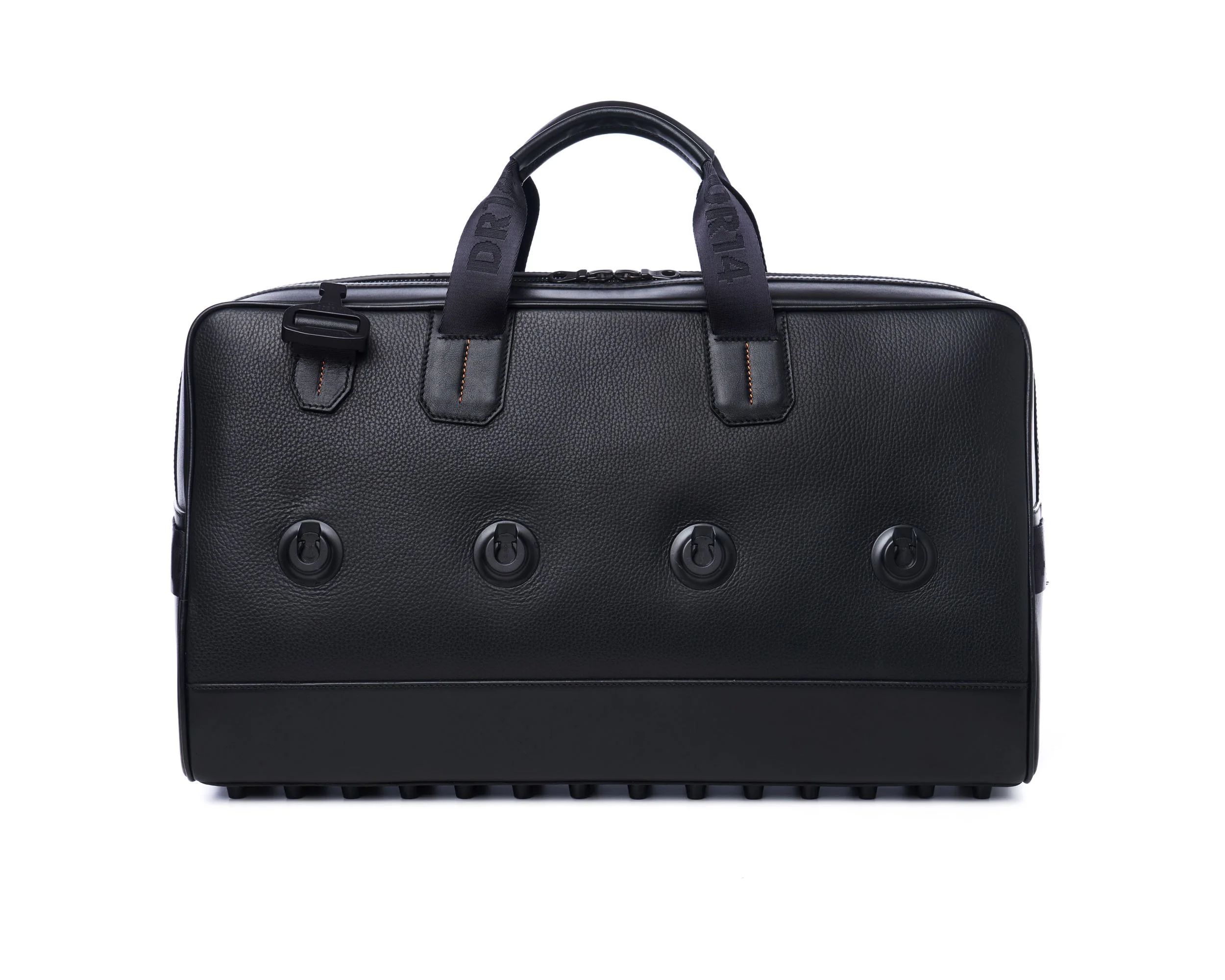
A black leather duffle shot on a controlled white set — every reflection balanced to keep depth and texture intact. ©Rare Studio LA
1. The Background Isn’t Always White
What looks white to the eye is often closer to gray on camera. The tone of the background changes depending on exposure, lighting position, and color temperature.
A true white background that meets e-commerce standards requires precision. Too much exposure and the edges disappear. Too little and the image feels dull. Achieving the right balance takes skill in lighting and post-production, not a single flash and a white sheet.
2. Shadows Give the Image Life
Many people try to remove all shadows, thinking it will make the photo cleaner. The result often feels sterile/cutout.
Soft, controlled shadows help define the product and create depth. Without them, bottles, boxes, and reflective surfaces lose shape and look unrealistic. Good lighting design doesn’t eliminate shadows, it uses them to make the object look natural and three-dimensional.
Even “simple” fabrics need nuanced lighting to stay dimensional and true-to-life. ©Rare Studio LA
3. Consistency Is the Hard Part
One image might look great on its own, but a full catalog exposes inconsistencies fast. One photo is cooler, another warmer, one brighter than the rest. Suddenly your brand feels uneven.
Consistency is what makes a collection look professional. Each image should match in exposure, color, and crop so everything feels like it belongs together. That’s what gives a brand polish and trustworthiness.
4. Editing Is More Than Cutting Out the Background
Automated tools can remove a background quickly, but they rarely produce results that look professional. Edges often appear fuzzy, shadows disappear, and the product looks unprofessional, that's why at Rare Studio LA, we are aware of the automated tools and the AI tools. But after testing, we still prefer cut out by professional retouchers.

Polished highlights and soft shadows make jewelry feel tangible, not cut out. ©Rare Studio LA
5. LIGHTING IS EVERYTHING
Lighting is the single biggest factor that separates an average product photo from a great one. Many people think it’s as simple as pointing a few lights at the product and pressing the shutter, but light quality matters just as much as light quantity.
The direction, intensity, and softness of the light all shape how a product feels. Good lighting reveals texture, depth, and build quality—it shows the materials for what they really are. It also preserves true color, which is essential for accuracy in e-commerce.
Too much light, on the other hand, can wash out details and make products look flat. Overexposure hides texture instead of enhancing it, and shadows disappear where you actually need them for definition.
Professional lighting isn’t about brightness. It’s about control. The right balance brings your product to life.
Why It Matters
White background photos are often the first impression of a product. They show up on ads, search results, and online listings before anyone clicks through to your site. Want help? At Rare Studio LA, we create high-converting product photography for brands that care about how they show up.
Explore our work at rarestudiola.com and see client reviews on Google.