Customers notice inconsistency faster than most brands realize.
Maybe not consciously—but visually.
One image feels polished.
The next feels darker.
Another has different shadows.
One product is tightly cropped, another feels off-center.
Individually, these details seem small.
Together, they create uncertainty.
And online, uncertainty reduces trust.
Consistent product photography does more than make a catalog look organized—it helps brands feel professional, reliable, and worth buying from.
Here’s why consistency matters more than many businesses think.
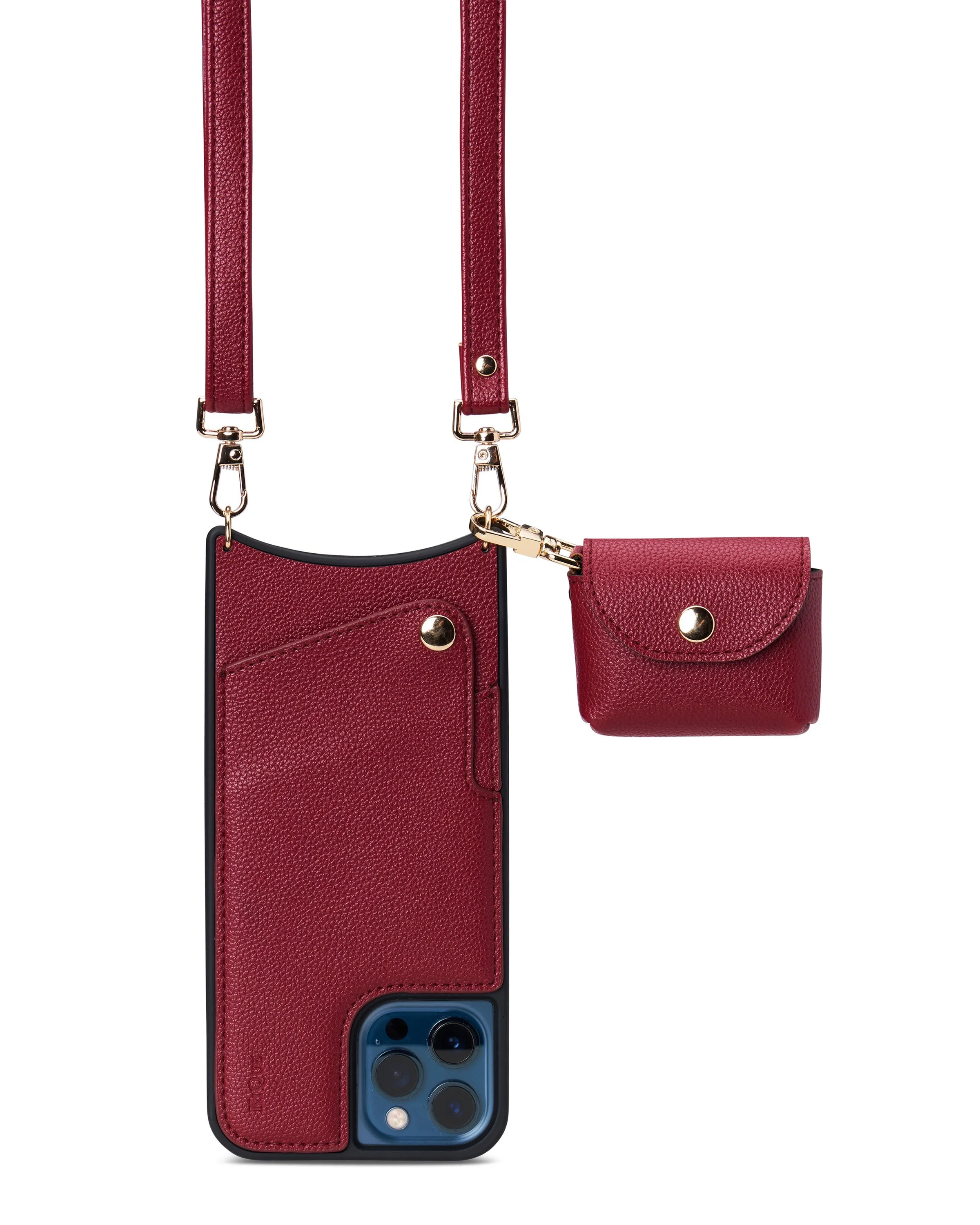
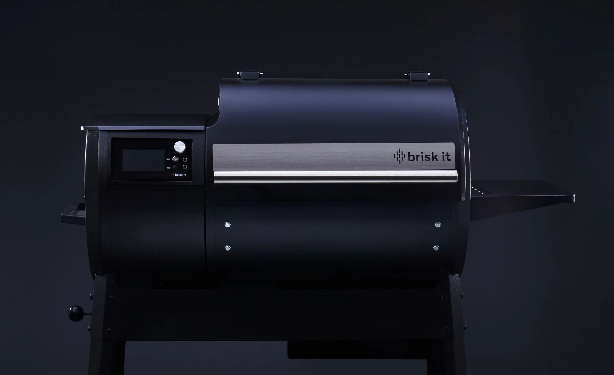
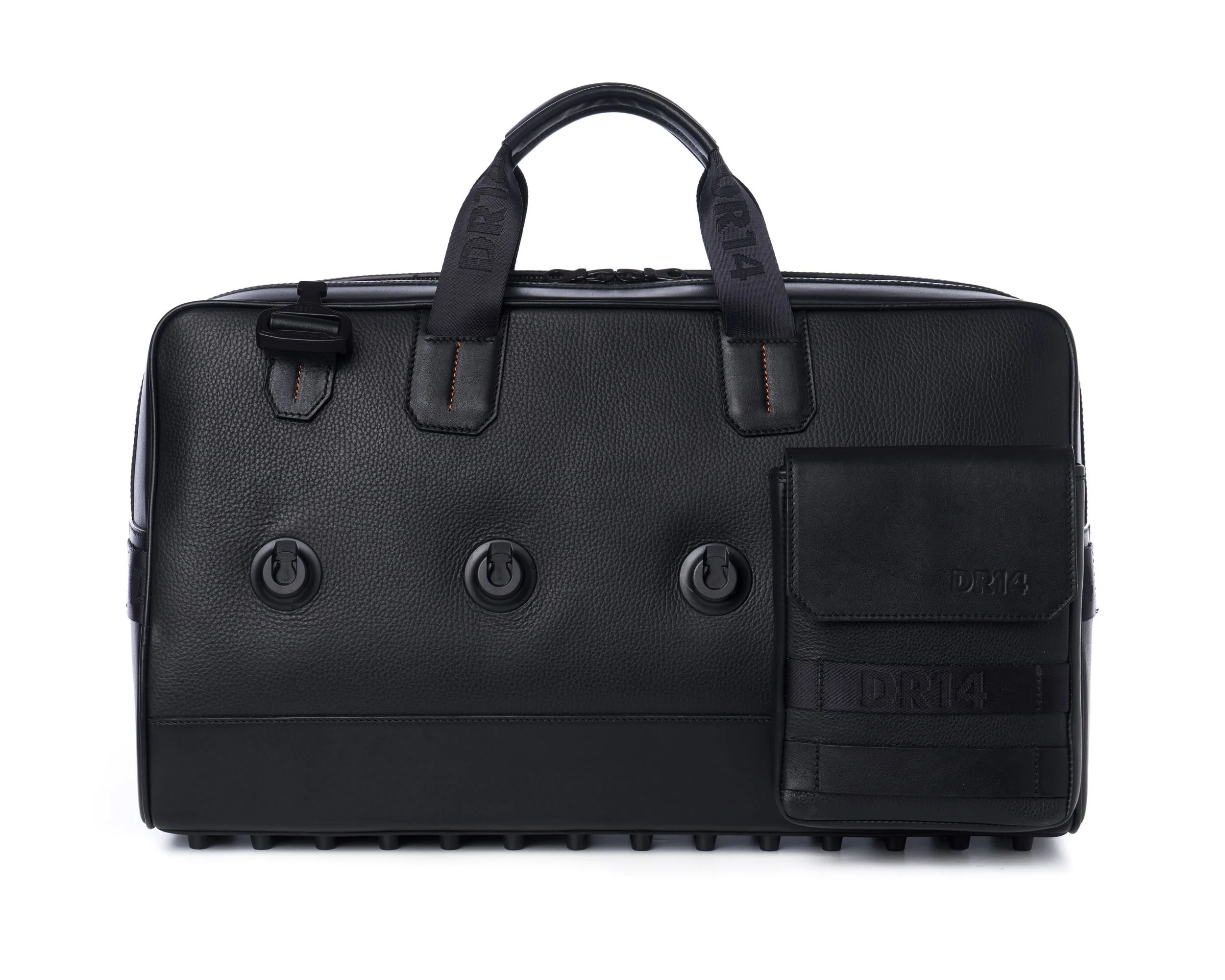
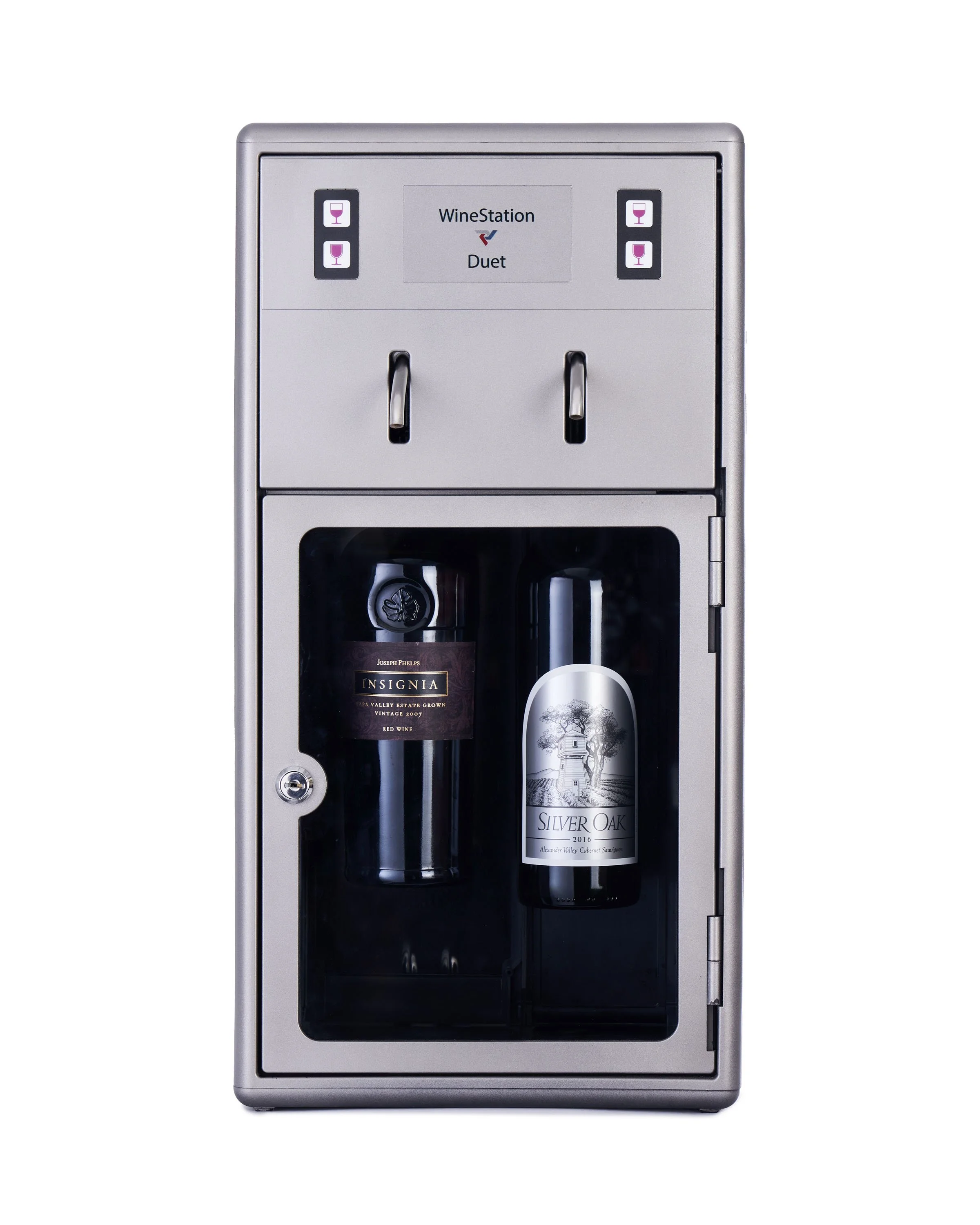
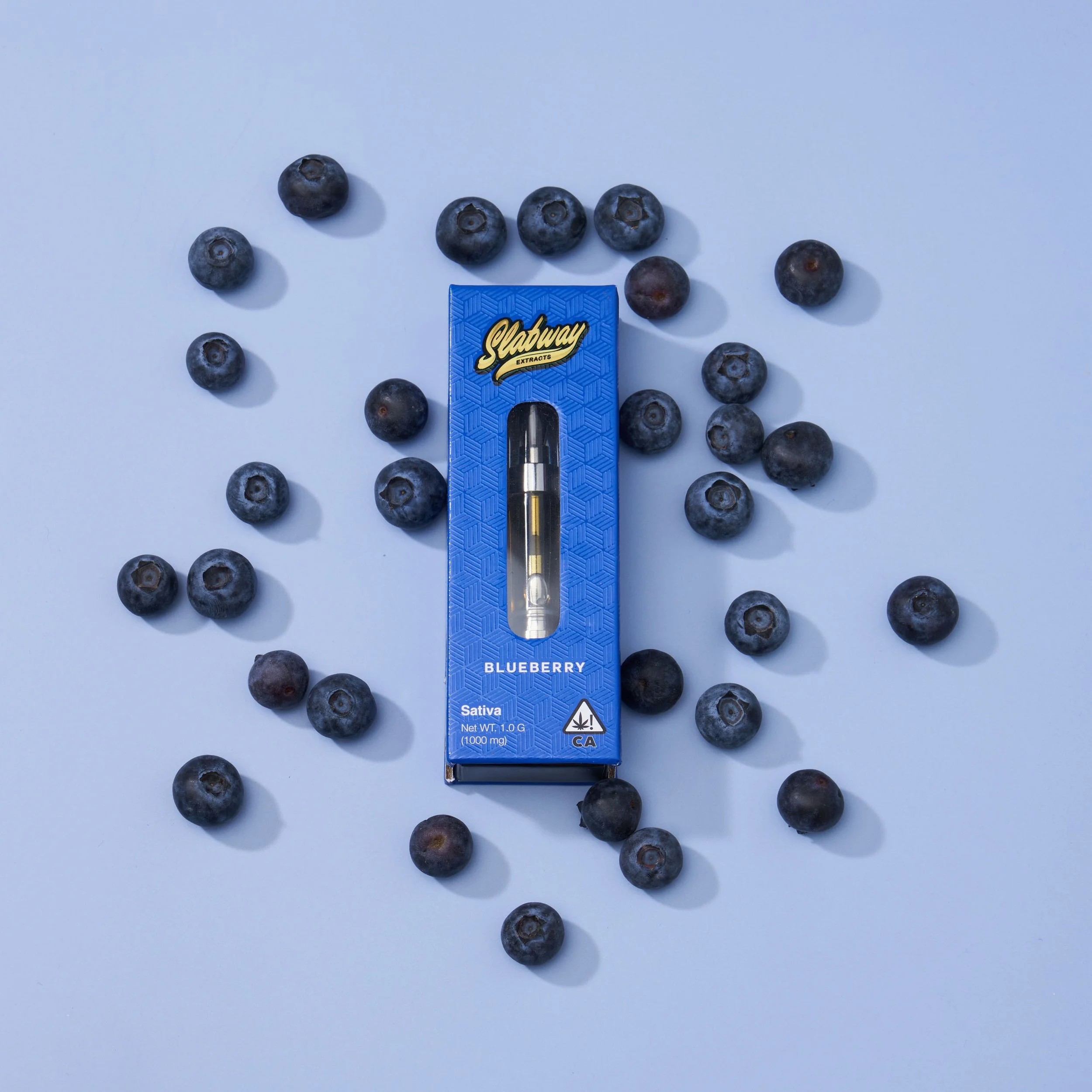
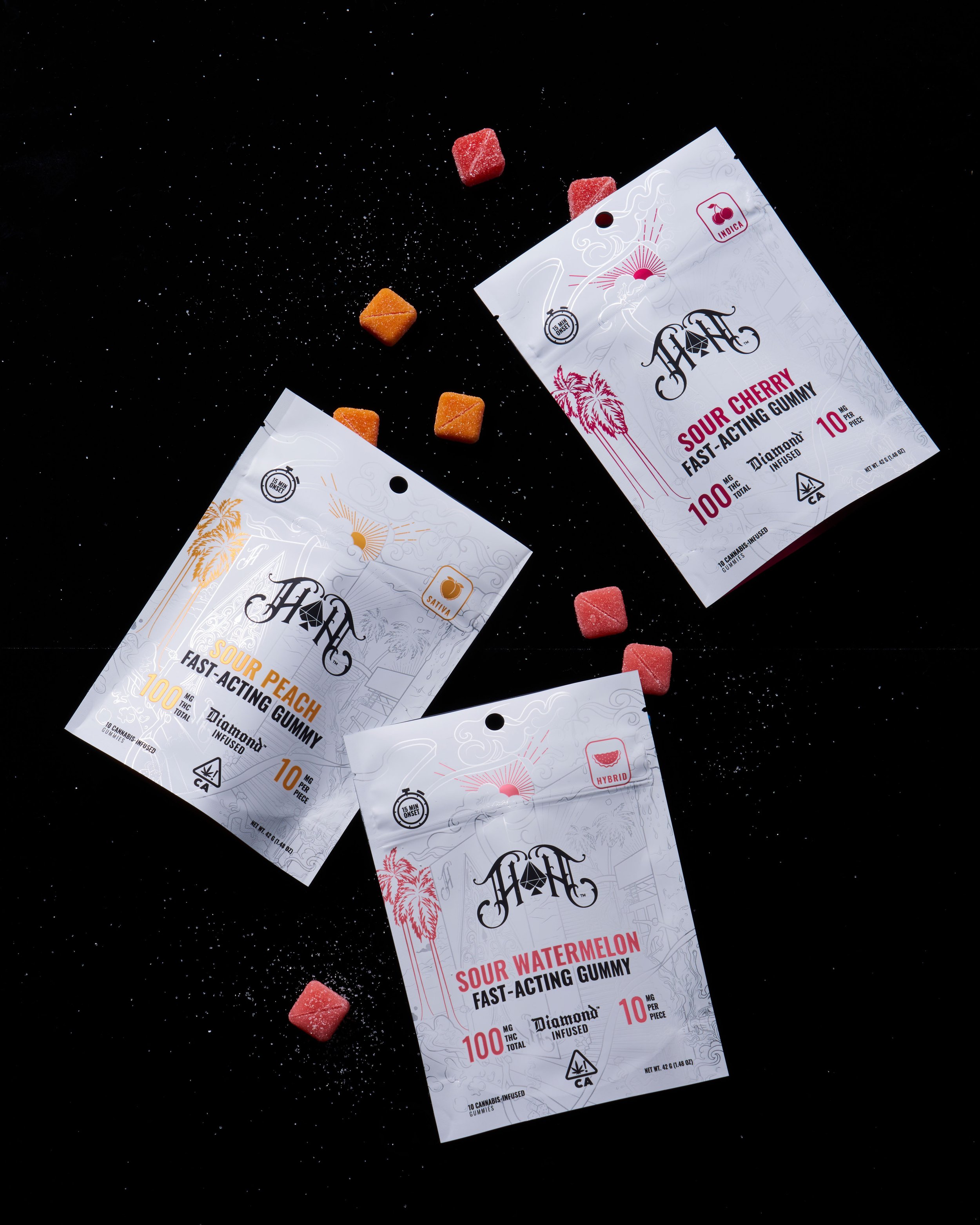
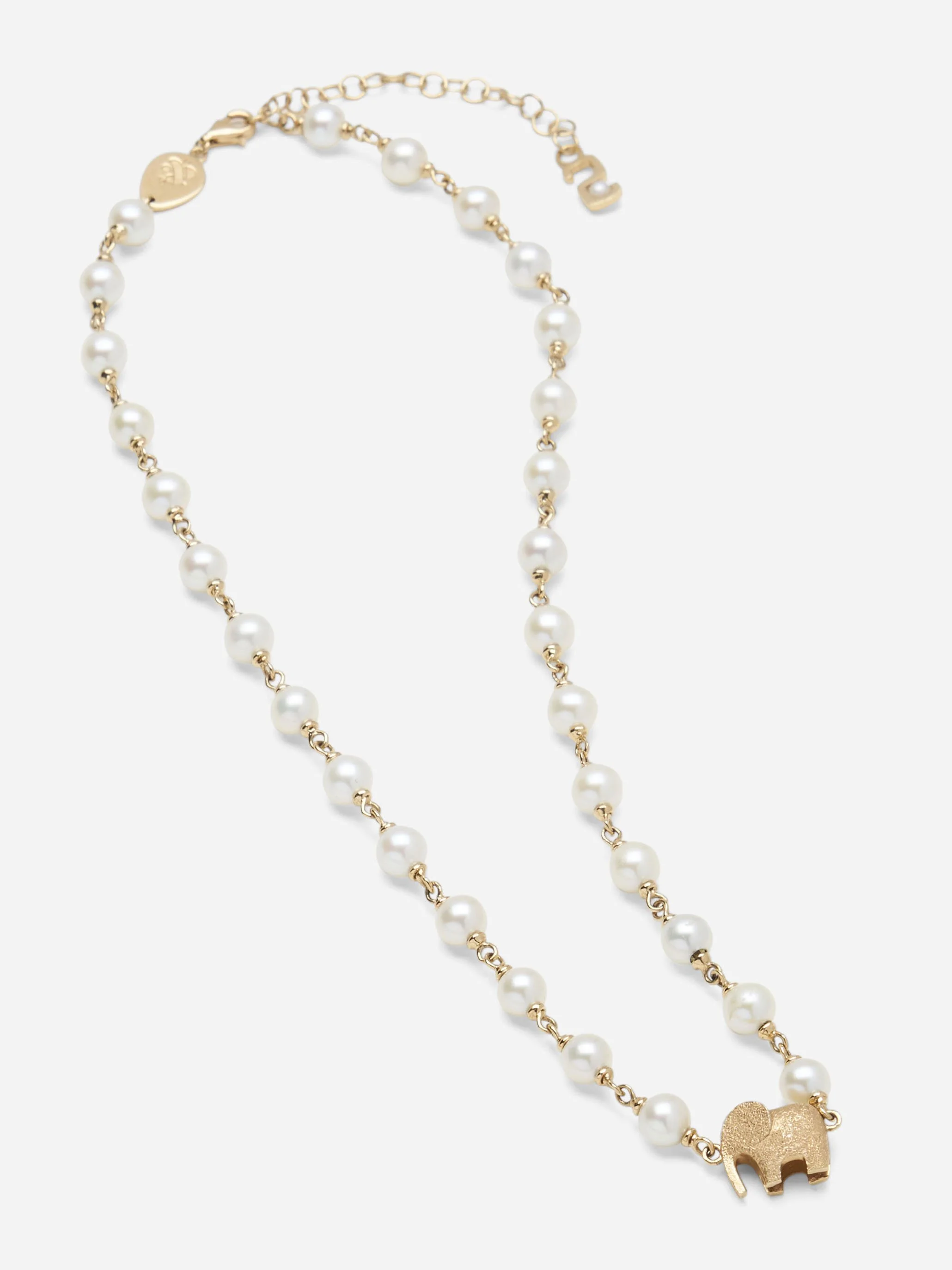
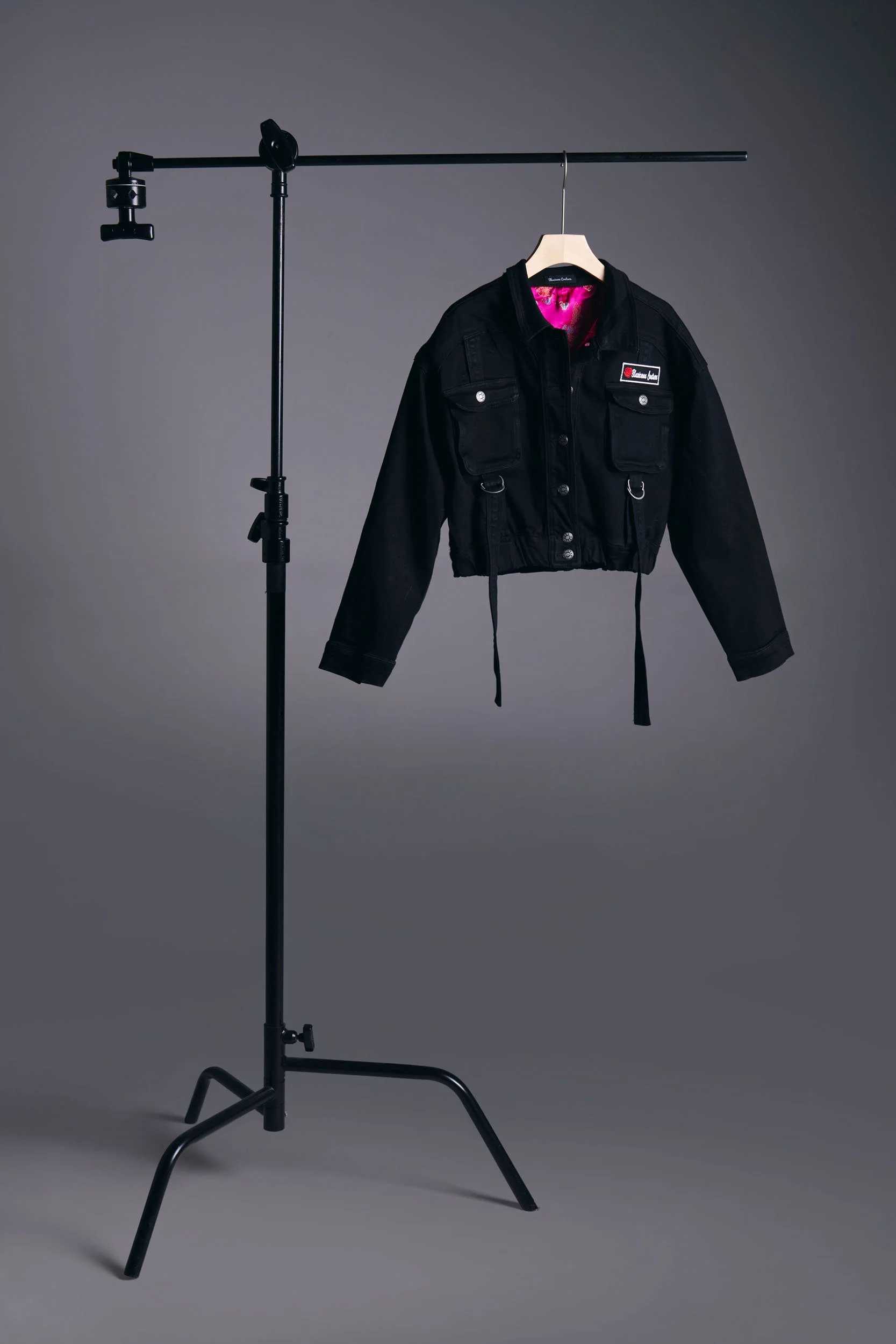
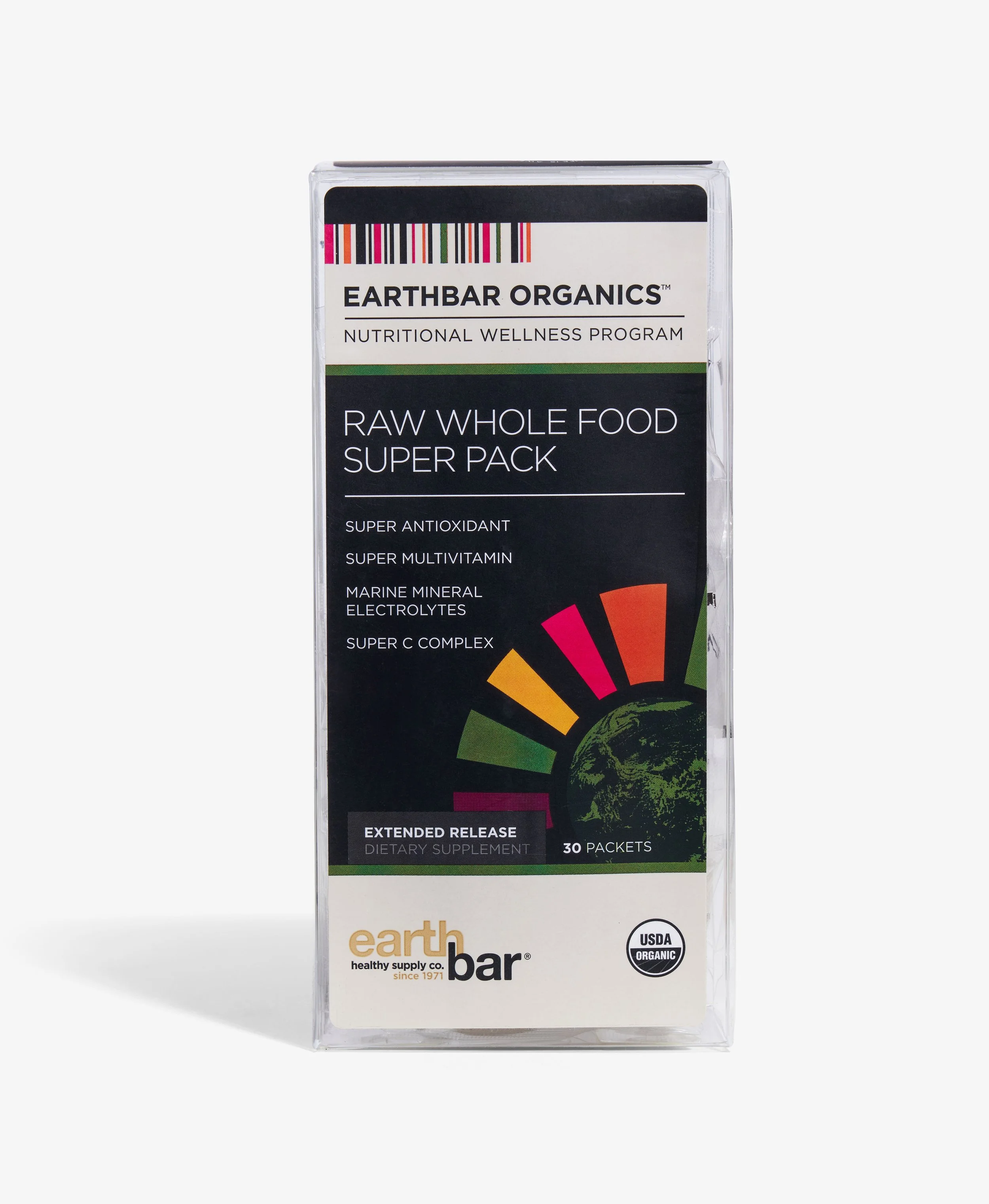
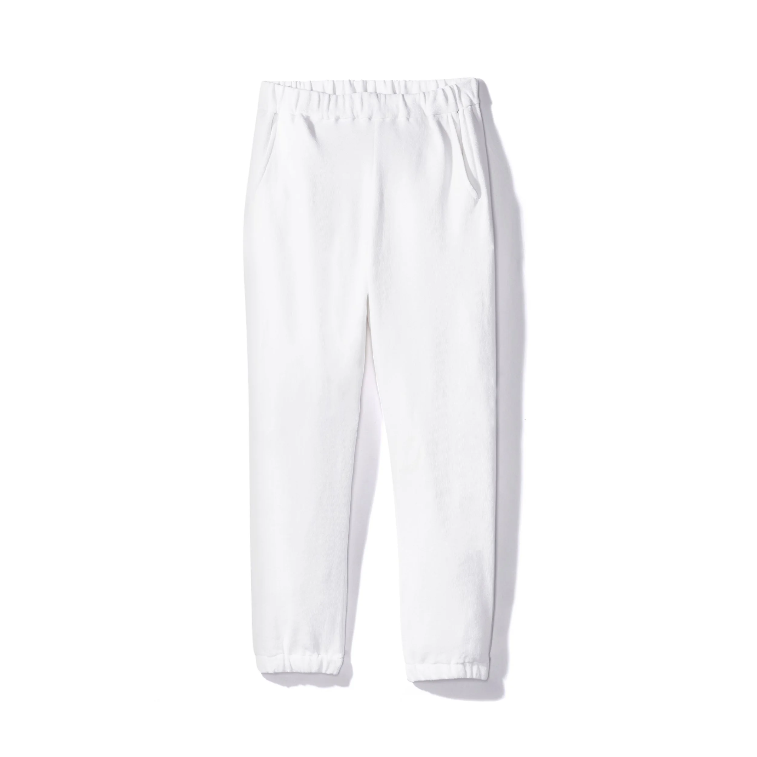
A consistent visual style makes products feel more trustworthy at first glance. © Rare Studio LA
1. Consistency Makes a Brand Feel More Professional
Customers make visual judgments quickly.
Before reading product descriptions or reviews, they’re already asking:
“Does this brand feel trustworthy?”
Inconsistent photography can make a business feel:
disorganized
low quality
unfinished
unreliable
Even if the products themselves are excellent.
Consistent photography signals:
attention to detail
professionalism
operational maturity
brand confidence
Visual consistency creates credibility.
2. Customers Trust What Feels Predictable
Trust often comes from predictability.
When every product image follows a consistent system:
lighting feels familiar
colors feel accurate
framing feels intentional
editing feels cohesive
Customers become more confident in what they’re seeing.
This matters especially for ecommerce because buyers can’t physically inspect products.
Consistency reduces doubt.
3. Inconsistent Images Create Unnecessary Friction
Small visual inconsistencies quietly create questions:
Is this the same material?
Why does this color look different?
Is this a different product line?
Will the product actually look like this in person?
Even subtle inconsistencies can increase hesitation.
And hesitation hurts conversion.
Good product photography isn’t only about making products look attractive.
It’s about making customers feel certain.
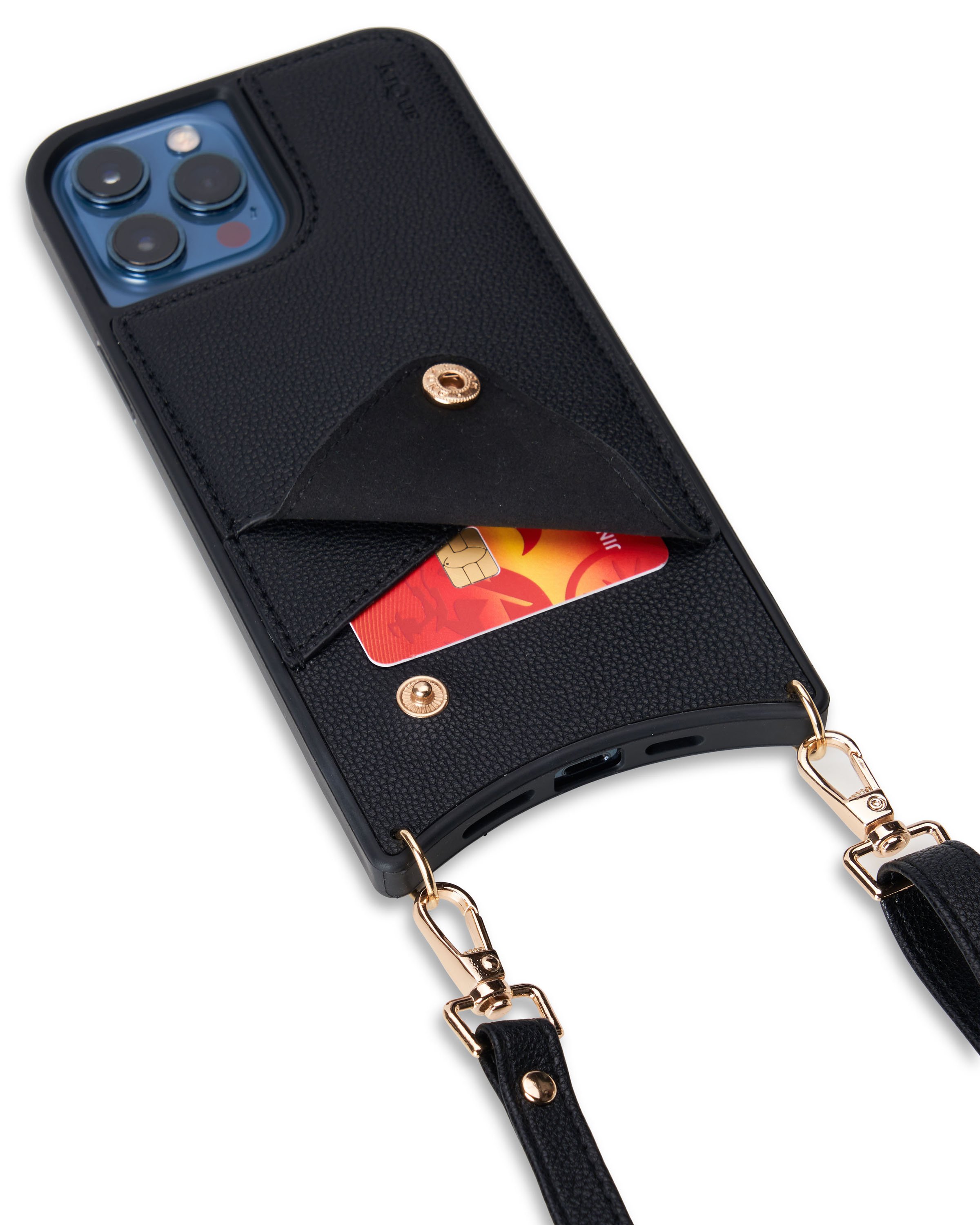
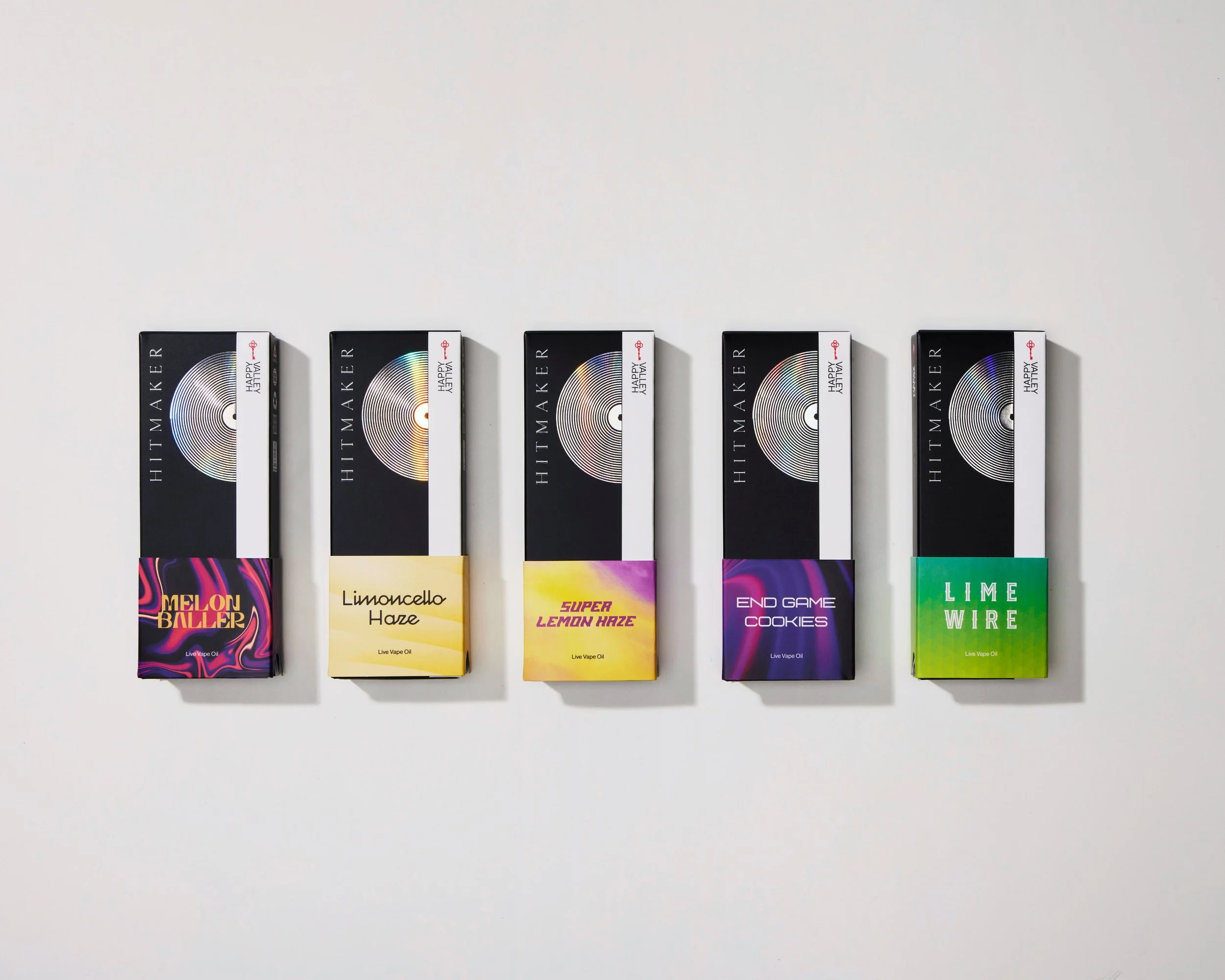
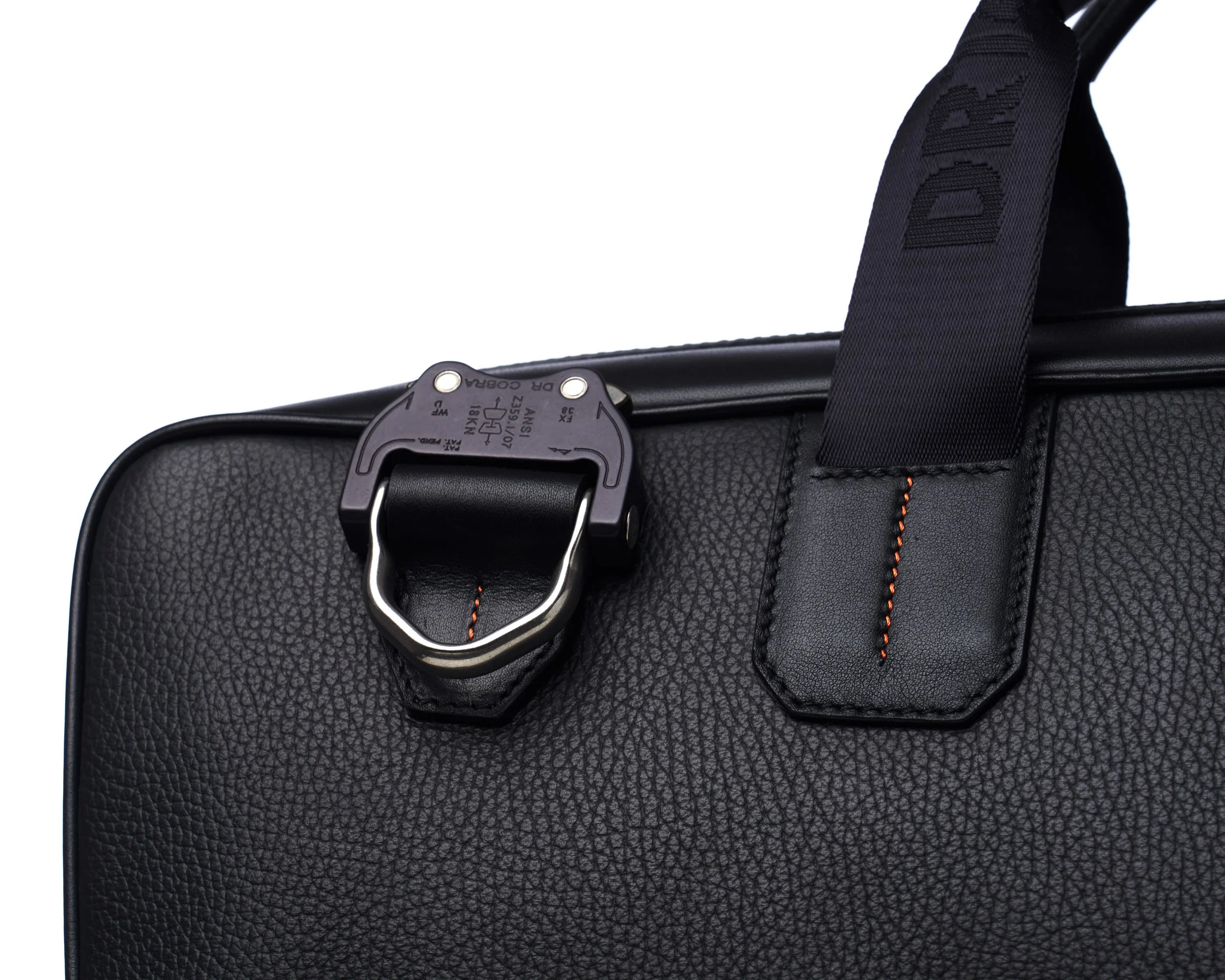
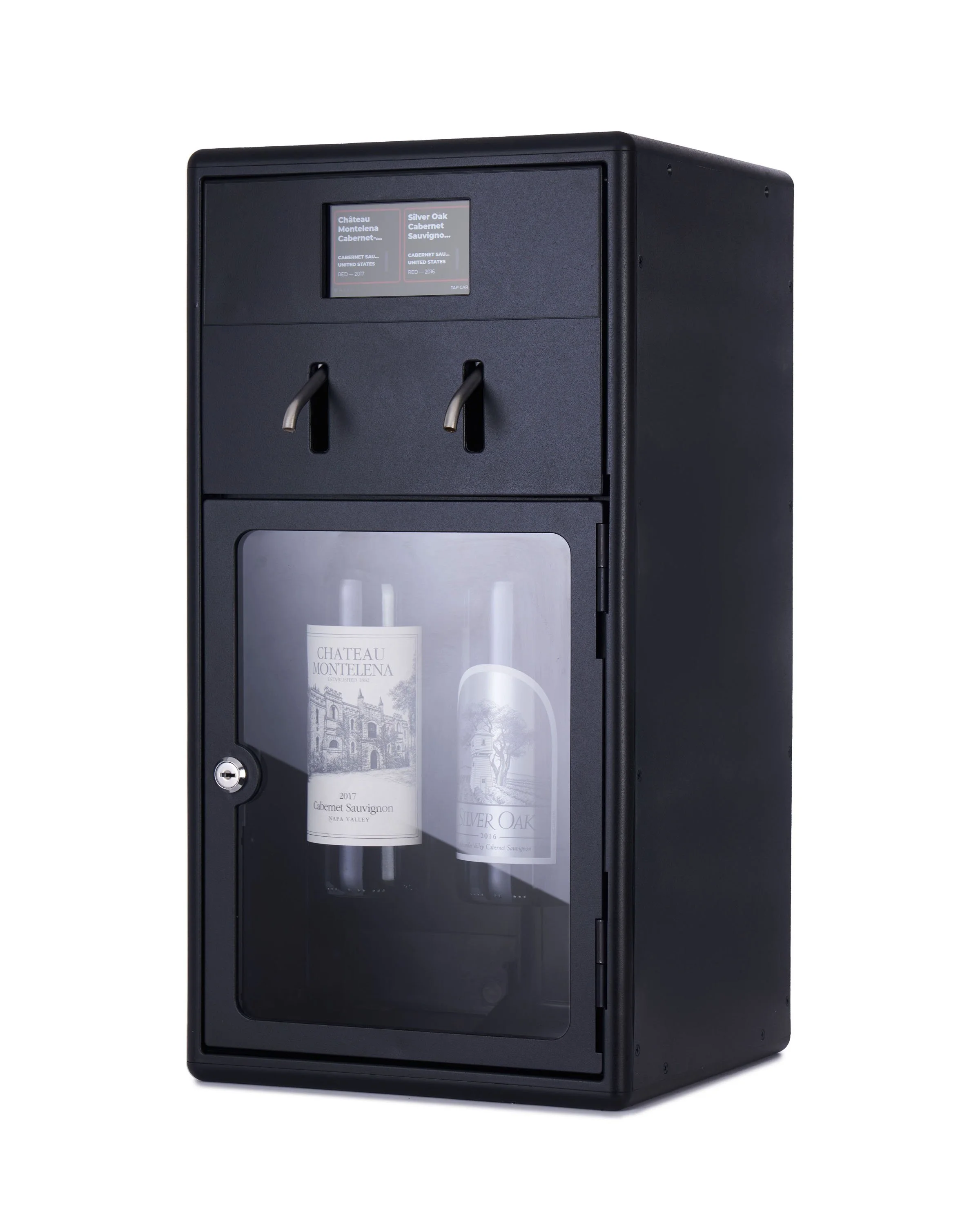
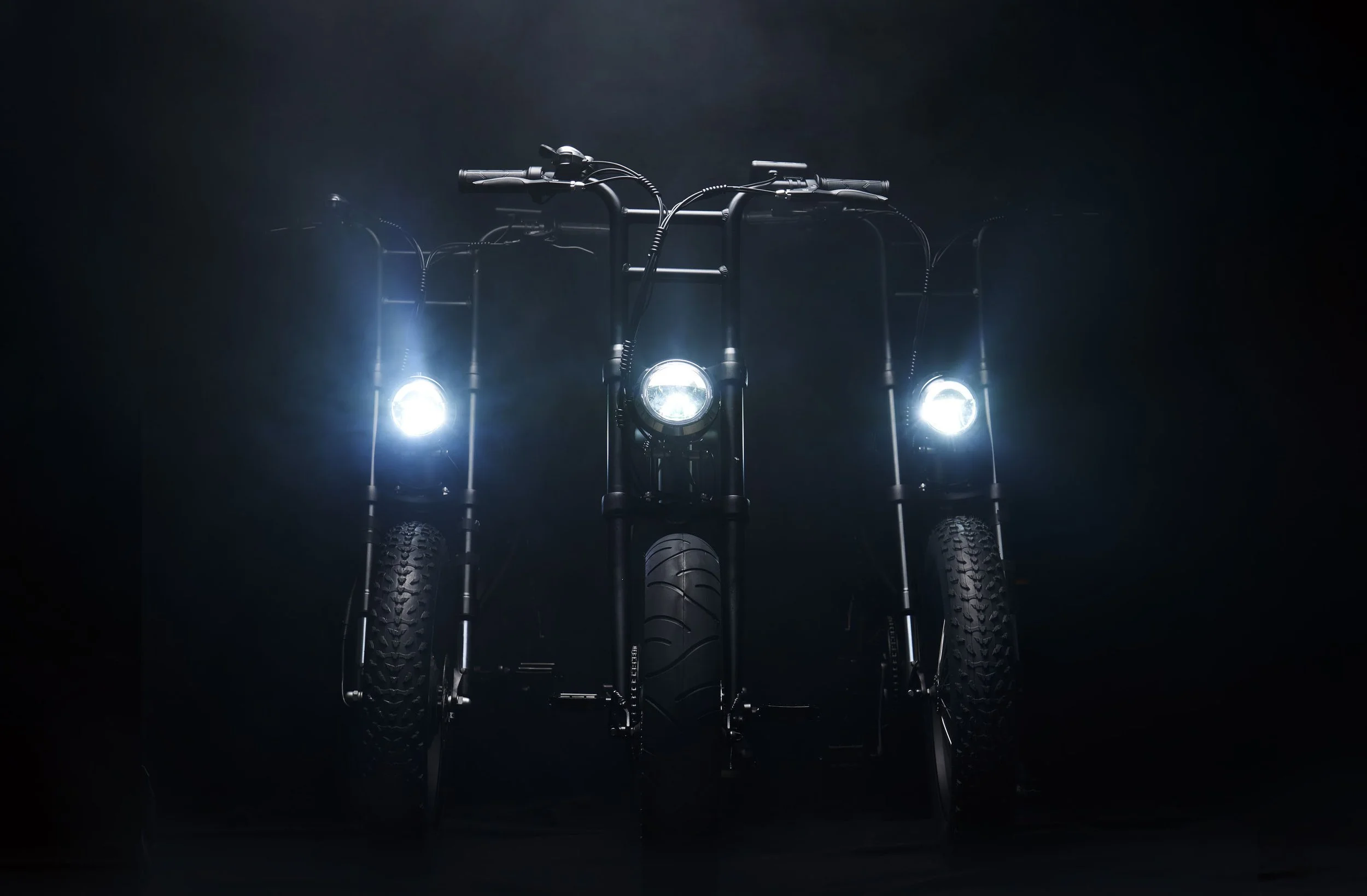
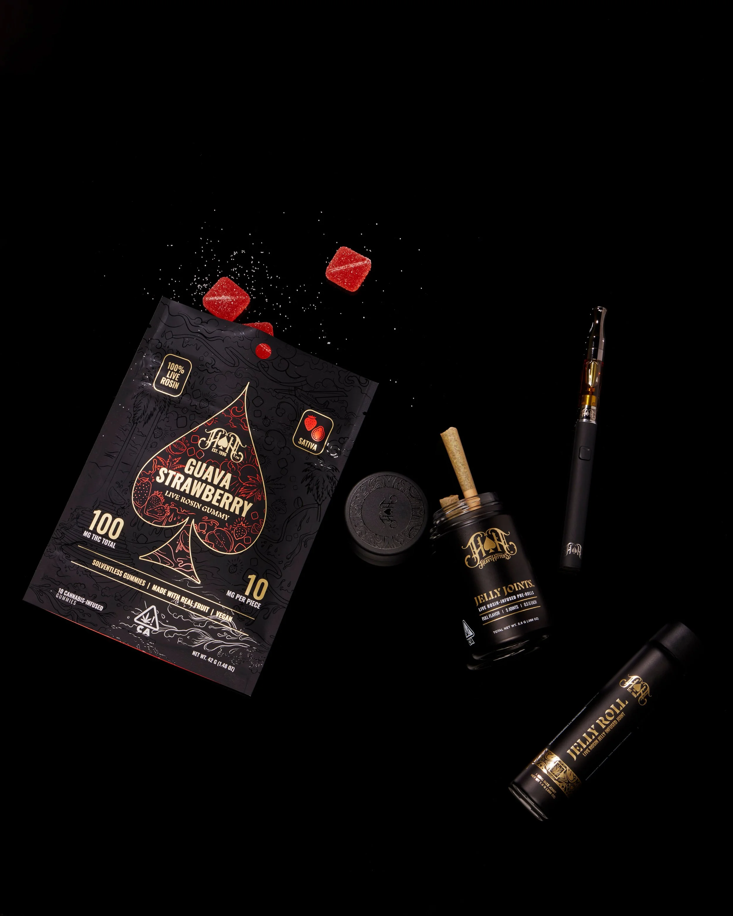
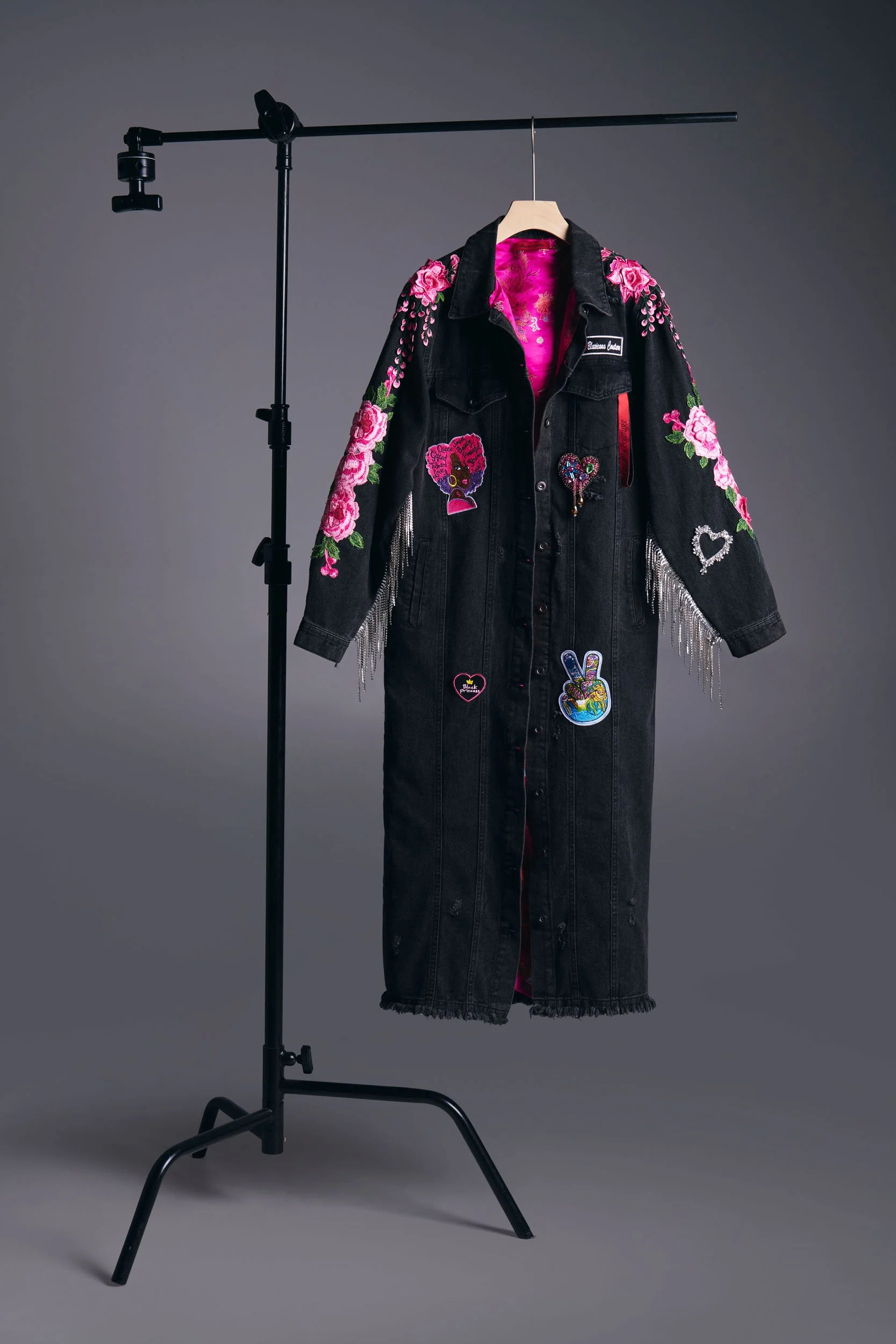
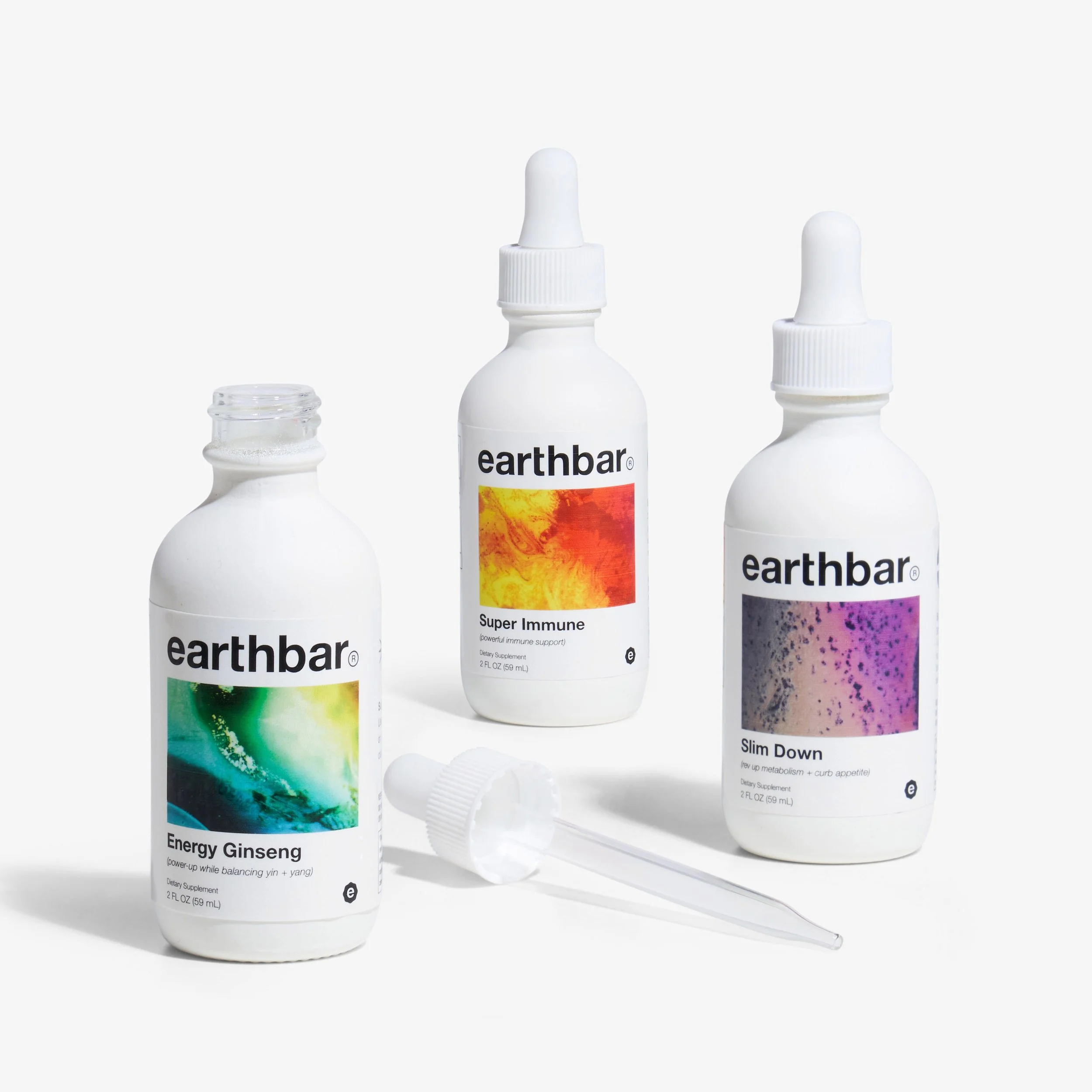
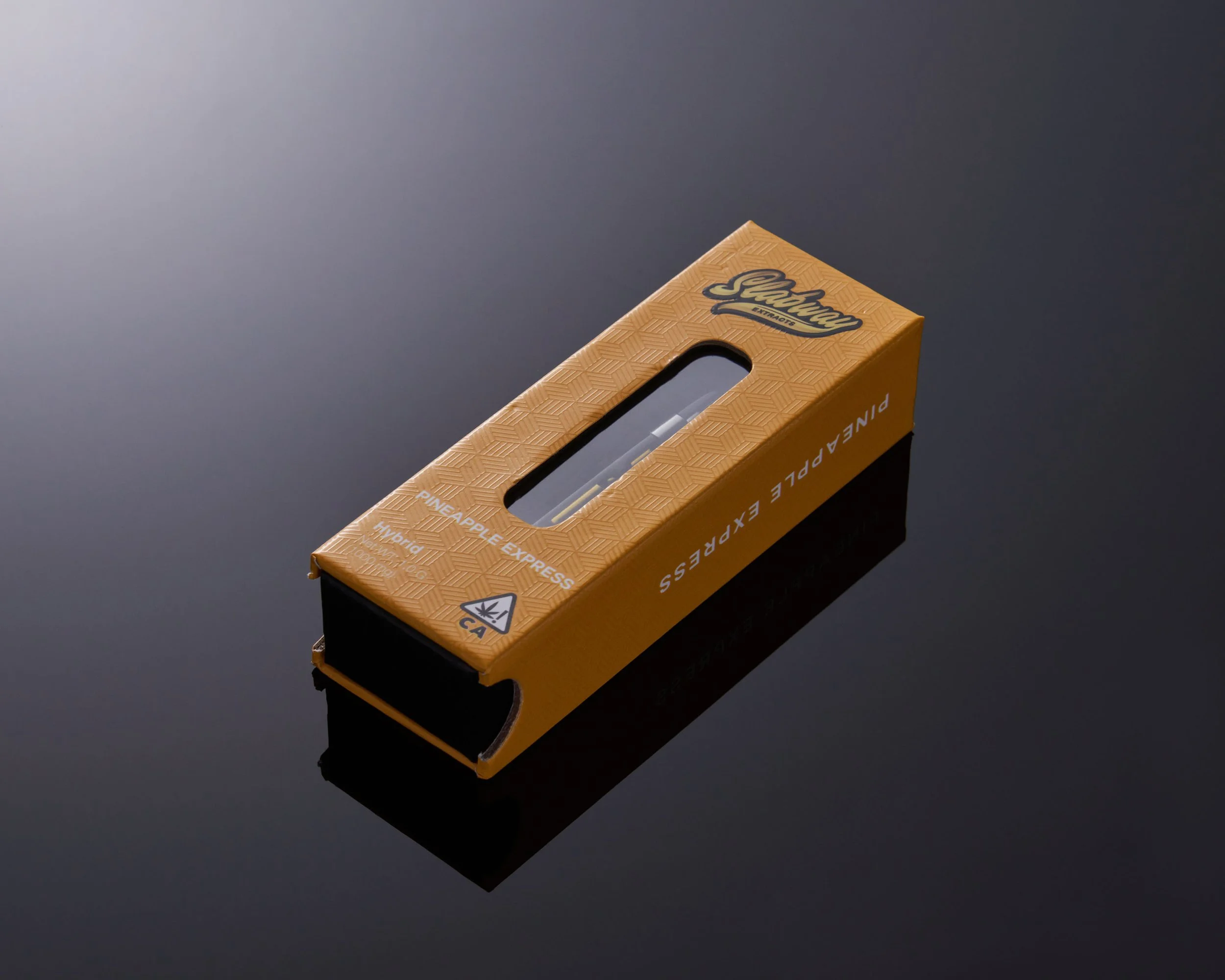
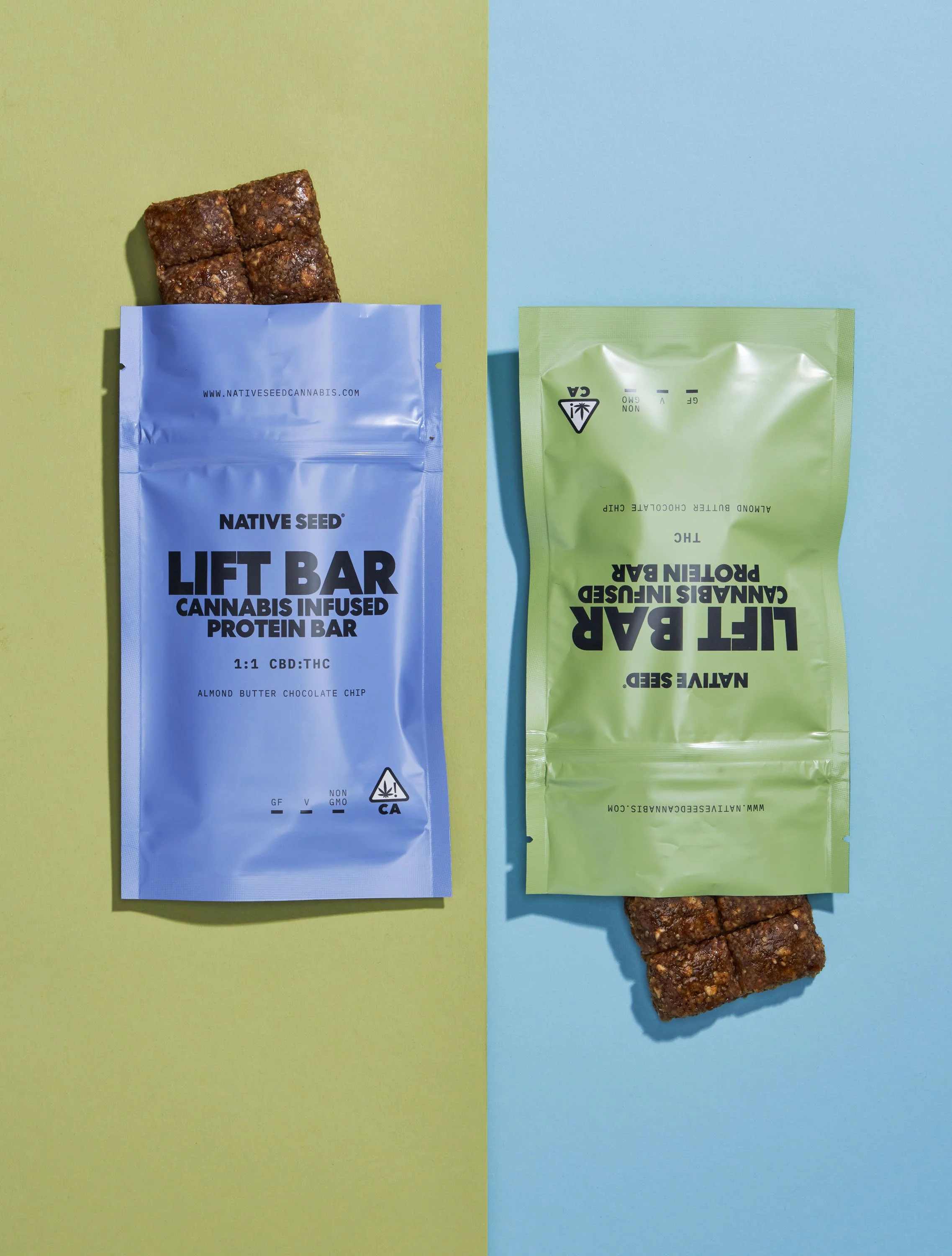
Clean close-up product details help customers feel confident about quality before buying. © Rare Studio LA
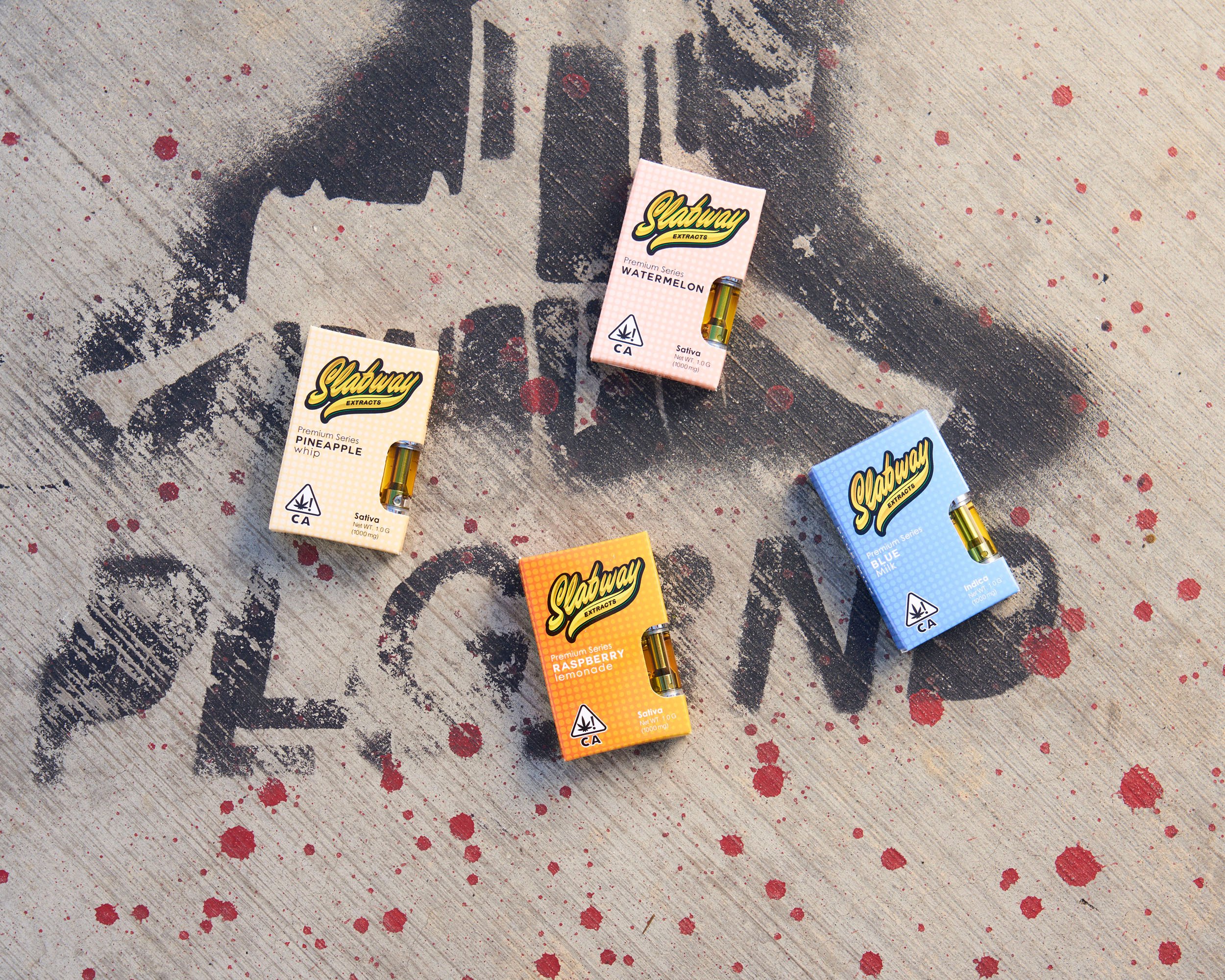
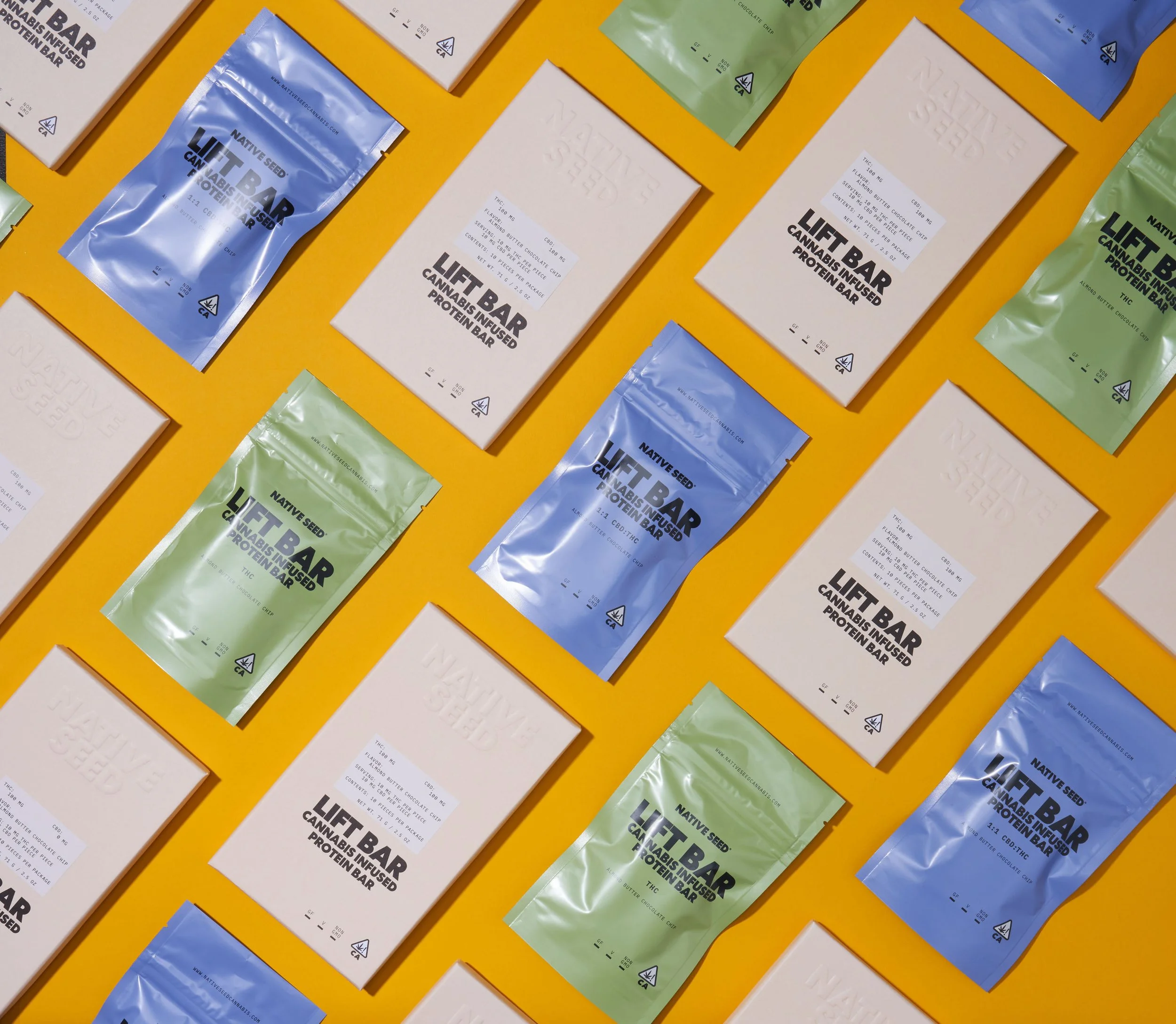
4. Strong Brands Build Visual Systems—Not Random Images
The most trusted brands don’t create product photos one at a time.
They build systems.
That includes consistency in:
lighting direction
shadow style
product positioning
crop ratios
background treatment
retouching standards
This helps every SKU feel connected to the same brand experience.
Consistency scales trust.
5. Consistency Improves Recognition
Strong visual consistency makes products easier to recognize instantly.
Over time, customers begin associating a certain visual style with your brand.
This helps:
strengthen brand recall
improve ad recognition
increase familiarity across platforms
When customers repeatedly see a visually consistent brand, trust grows naturally.
Familiarity matters online.
6. Consistency Supports Higher Perceived Value
Luxury and premium brands are usually highly consistent visually.
Why?
Because inconsistency often feels cheap.
Premium perception comes from control.
When every product image feels intentional, customers often assume:
higher quality standards
better manufacturing
stronger brand reliability
Perception affects pricing power more than many brands expect.
7. Consistency Matters Across Every Channel
Product photography shouldn’t feel disconnected between:
ecommerce pages
Amazon listings
paid ads
email campaigns
social media
When visuals shift too dramatically between platforms, the brand experience weakens.
A consistent visual identity makes marketing feel stronger everywhere.
8. Trust Is Built Through Repetition
Most customers don’t buy immediately.
They encounter brands repeatedly:
through ads
product pages
email campaigns
retargeting
Every interaction reinforces—or weakens—trust.
Consistent photography compounds over time.
It quietly teaches customers:
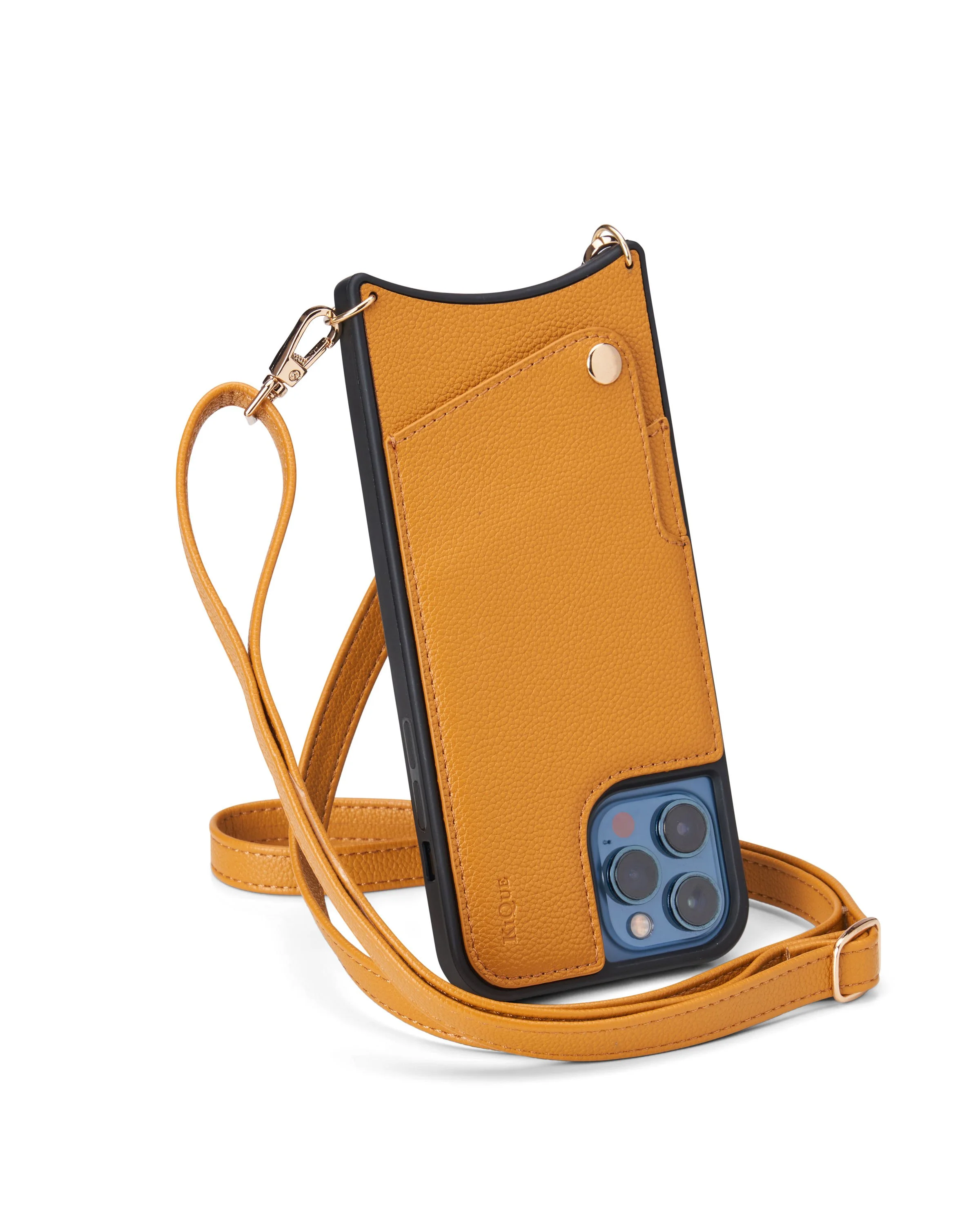
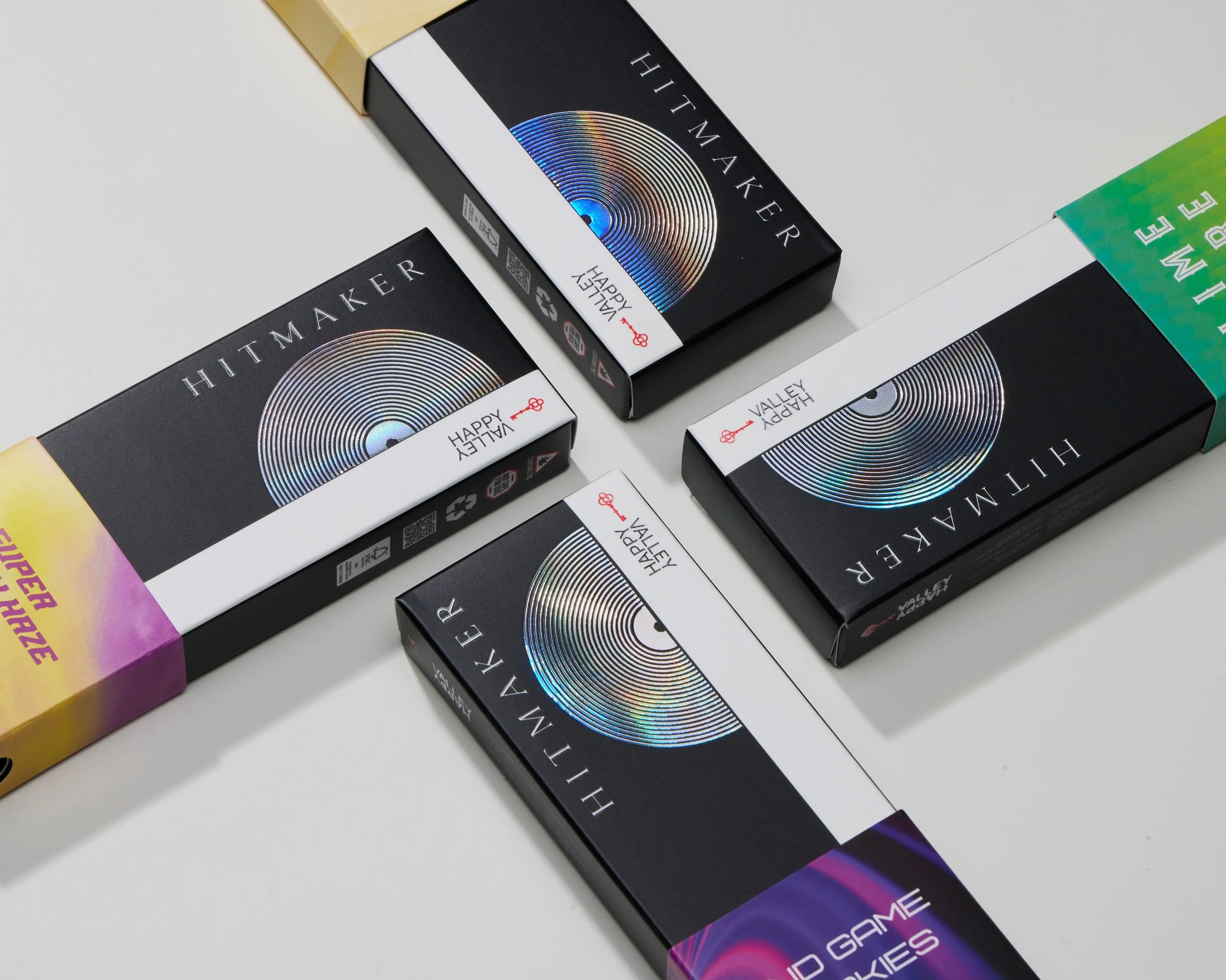
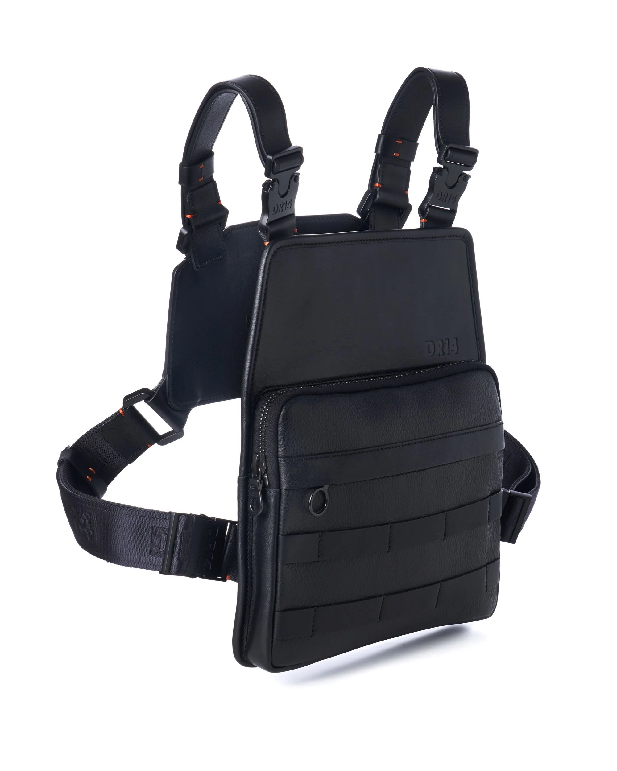
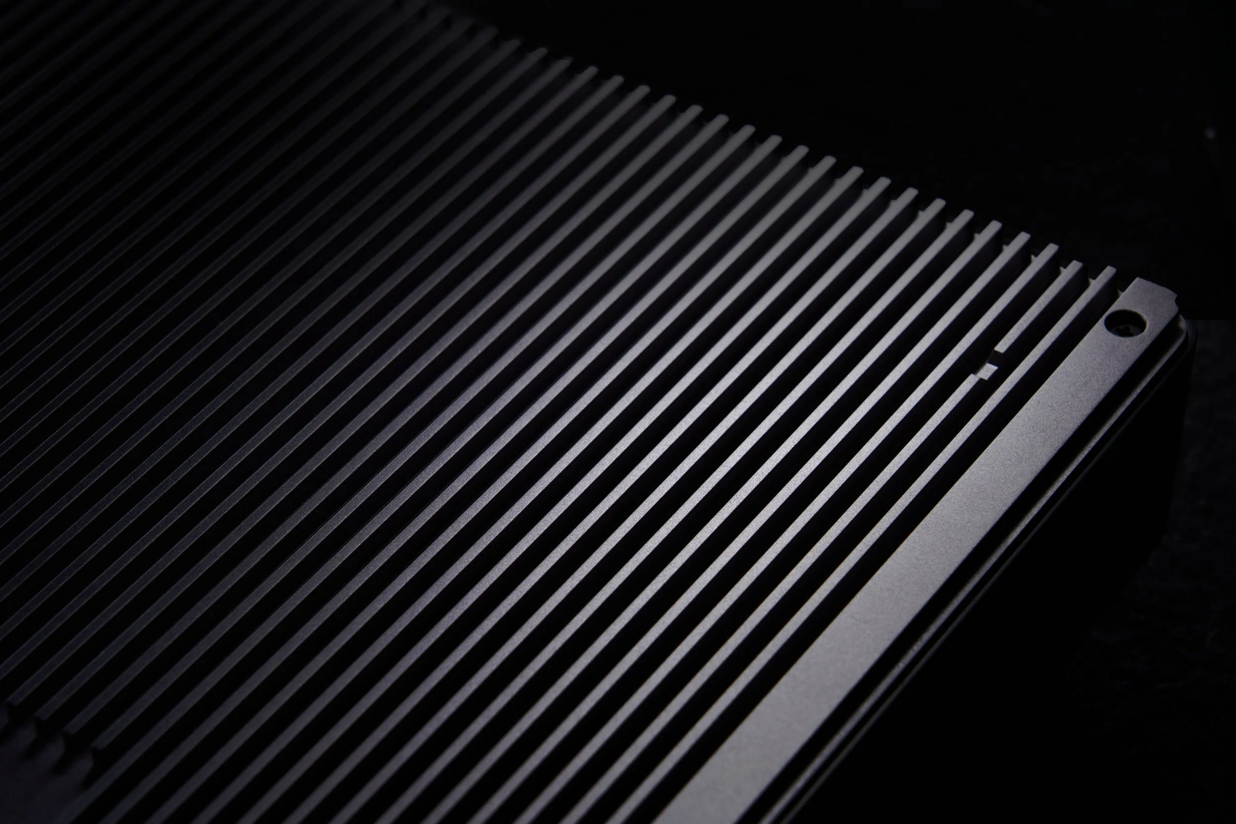
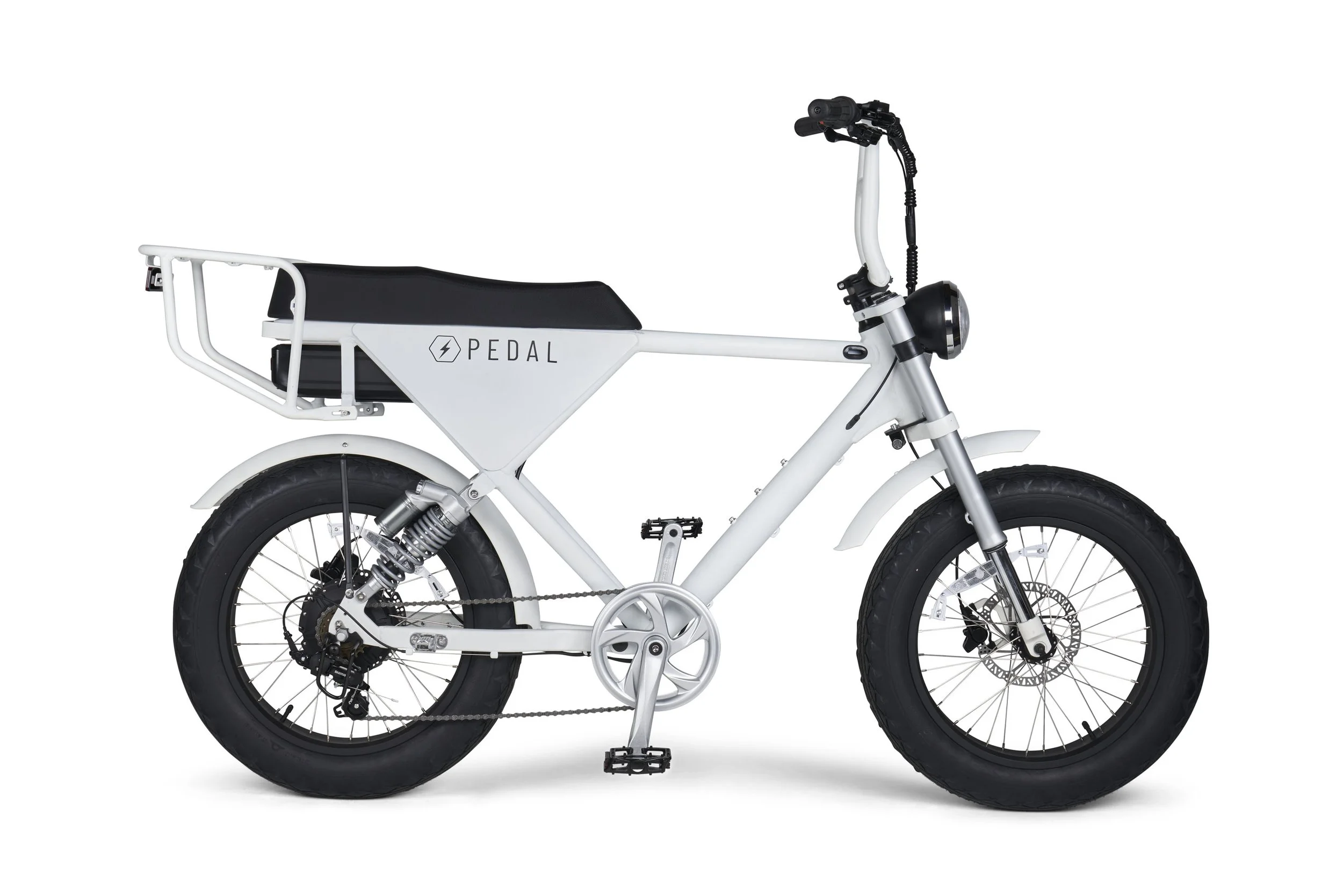
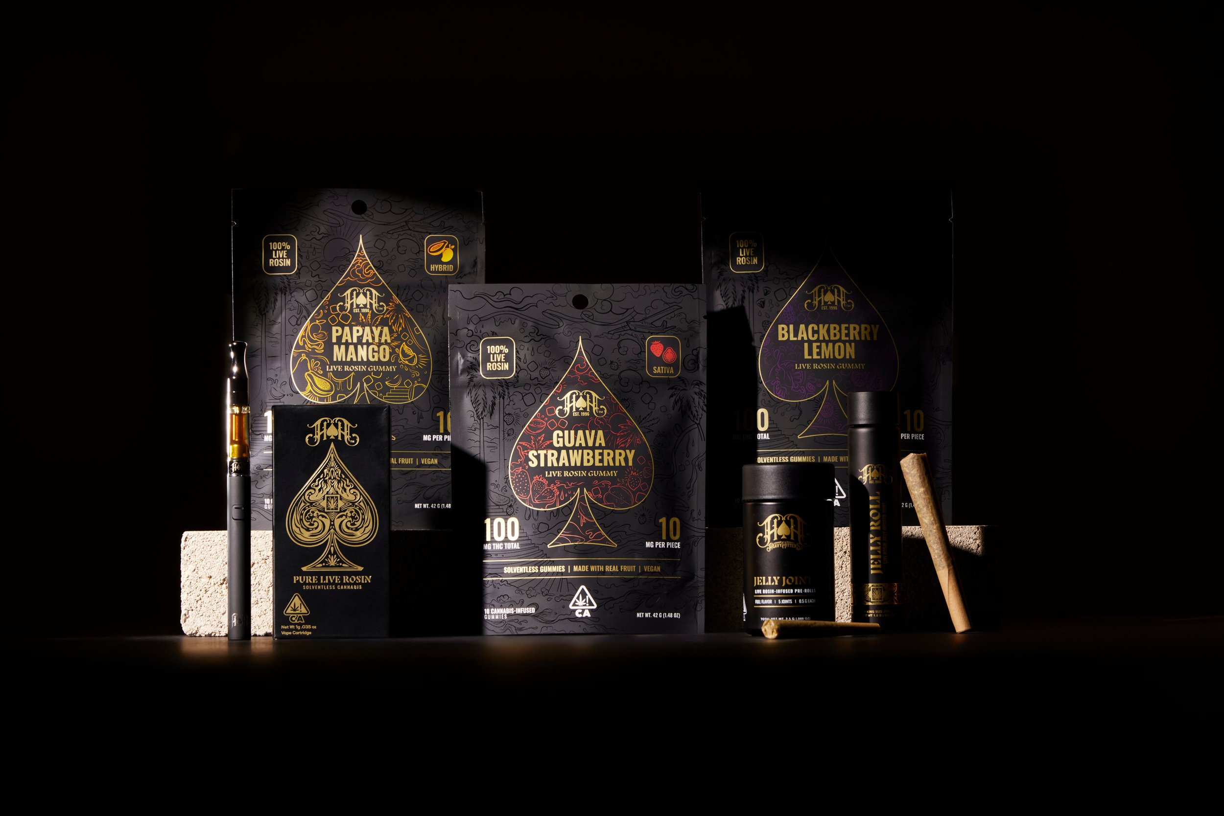
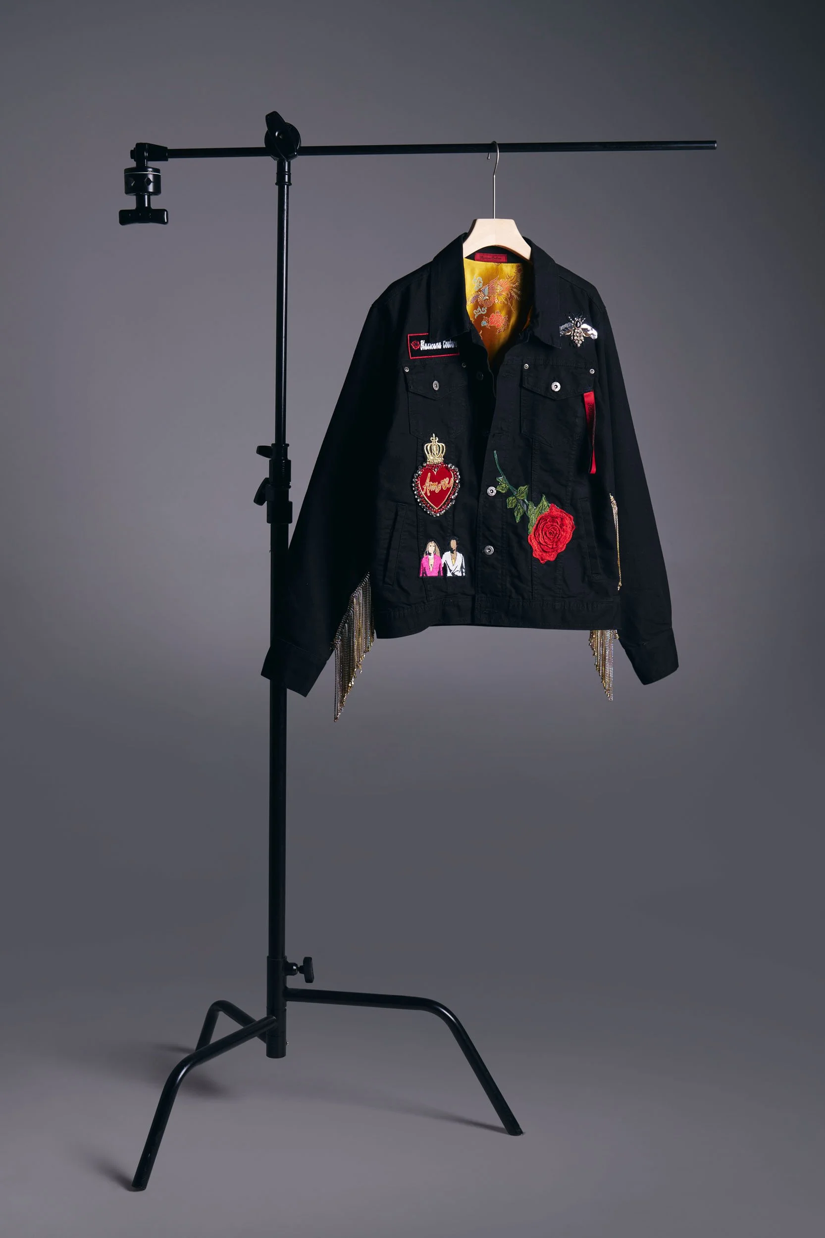
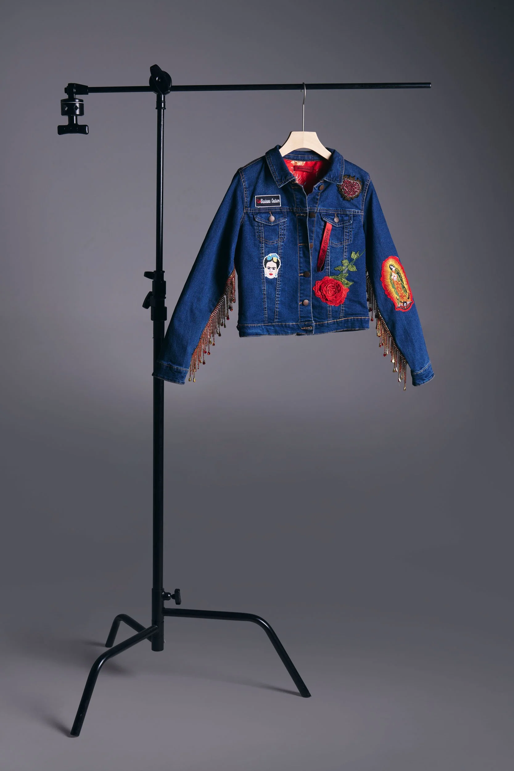
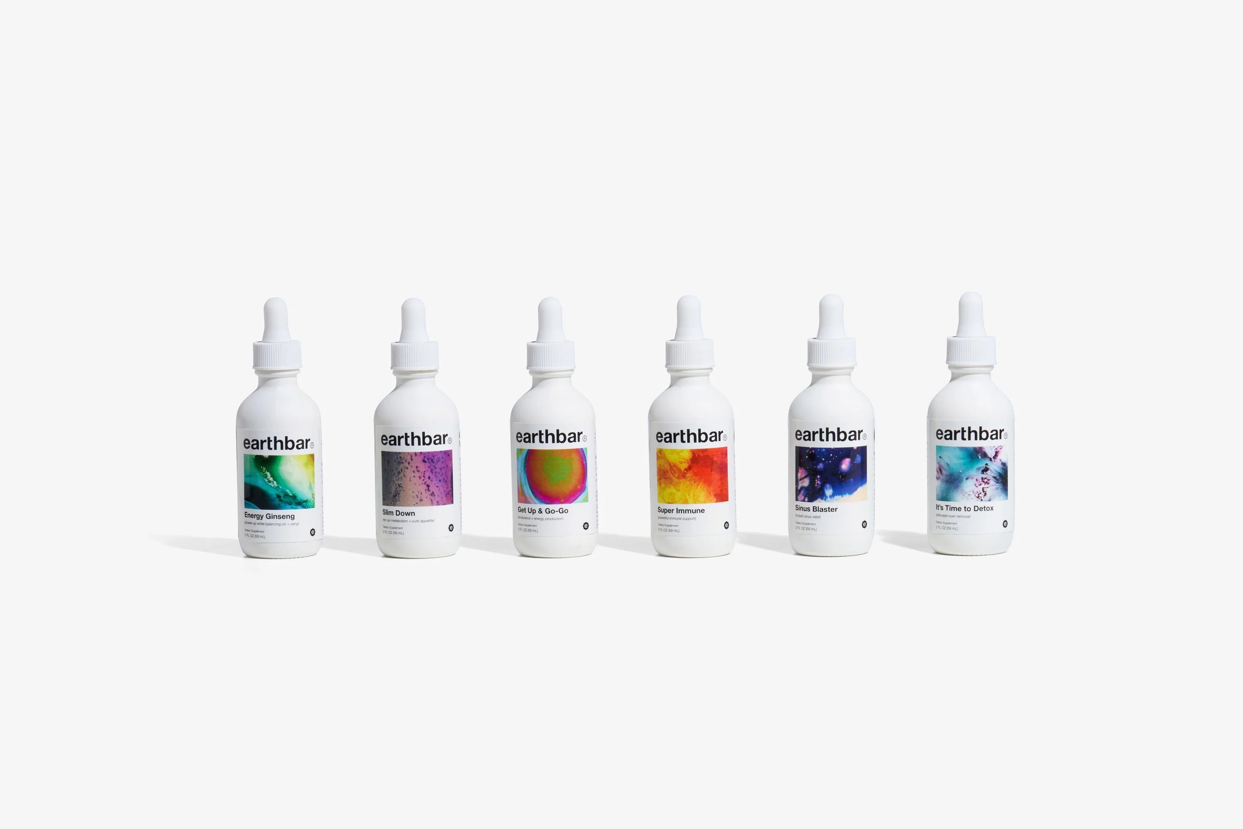
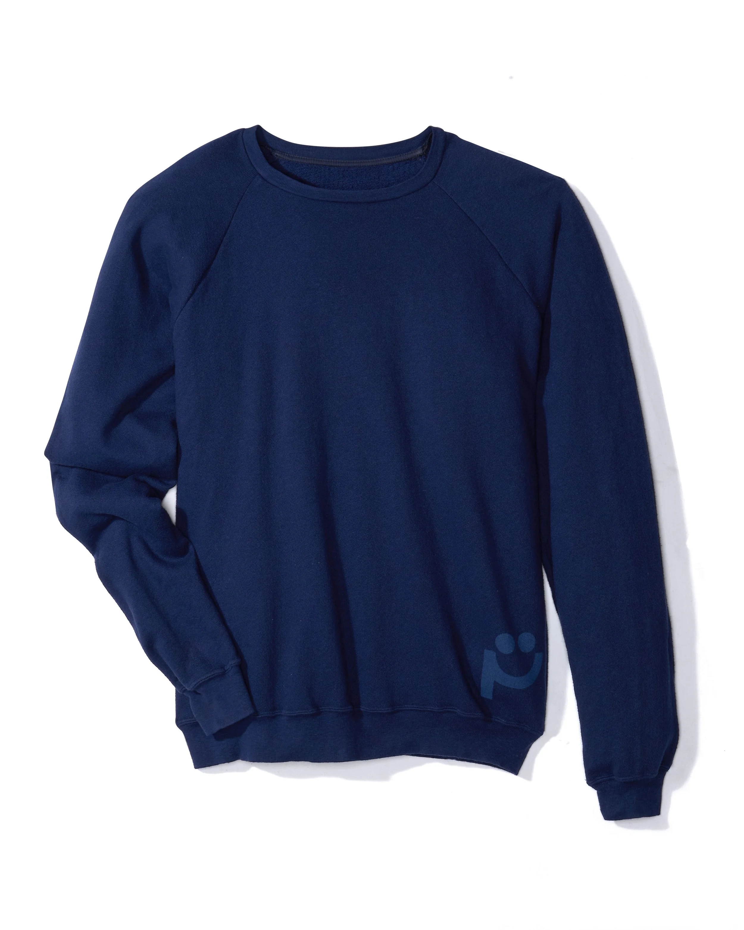
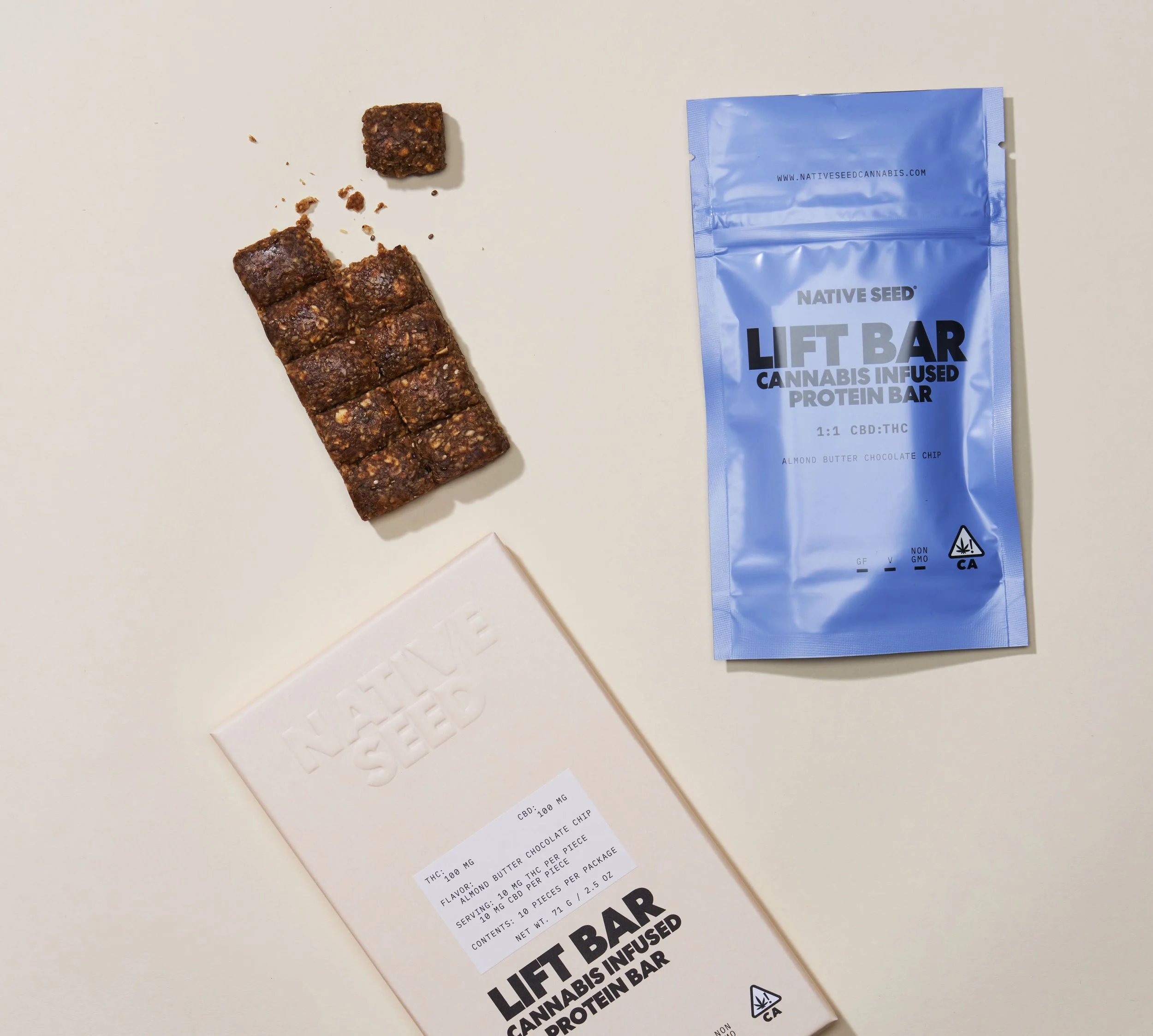
When every product photo follows the same visual language, the brand feels stronger and more reliable. © Rare Studio LA
“This brand feels stable.”
And stable brands feel safer to buy from.
The Bottom Line
Consistent product photography isn’t just a design preference.
It affects:
trust
perceived quality
customer confidence
brand recognition
conversion performance
Online, customers can’t touch products.
So they judge reliability visually.
And often, consistency becomes the difference between:
“This feels trustworthy.” and**“Something feels off.”**
Want your product photography to feel more cohesive across your brand?
Consistency doesn’t happen by accident—it comes from building a repeatable visual system that works across products, platforms, and campaigns.
At Rare Studio LA, we help brands create product photography systems designed for consistency, trust, and long-term brand growth.
You can explore our work at rarestudiola.com, and check our Google reviews if you want to hear from teams we’ve partnered with.