
Lay-flat photos should be the simplest clothing images to produce.
Place the garment on a backdrop, smooth it out, take a photo—done.
That simplicity is exactly why so many brands end up with photos that look flat, lifeless, or lower-end than the product deserves. Lay-flat photography is unforgiving. There’s no model, no scenery, no styling to hide behind. Every wrinkle, shadow, and composition choice becomes part of how your brand is judged.
The good news: most of the problems that make lay-flats look “cheap” are completely fixable once you understand what actually creates a premium look.
Here’s a breakdown of where things typically go wrong—and how to elevate your imagery.
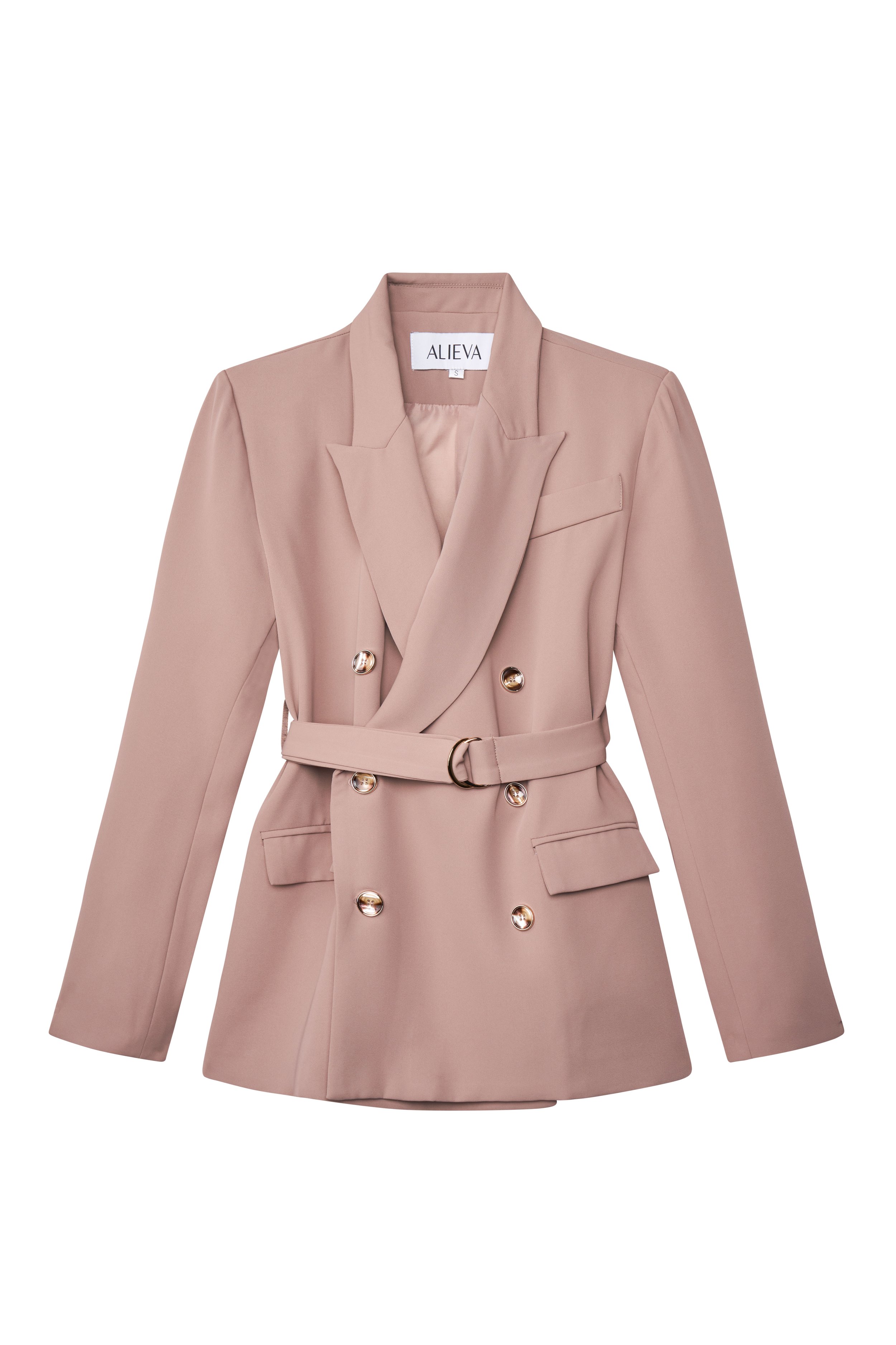
Precise garment prep and balanced lighting are what make a lay-flat feel tailored, not flat. © Rare Studio LA
1. The Clothing Isn’t Prepped Properly
Most low-quality lay-flats go wrong before the camera is even turned on.
Wrinkles, uneven hems, lint, dust, and puckered seams are all magnified when a garment lies flat. A photo can never look elevated if the fabric itself isn’t.
What elevates it:
Proper steaming and smoothing
Aligning hems, seams, and collars
Using pins or small clips to support shape
Removing lint and loose threads before shooting
Prep work takes time, but it prevents 90% of unnecessary retouching.
2. The Lighting Is Too Harsh—or Too Soft
Clothing needs dimensional lighting to show shape, texture, and structure.
Too soft, and everything looks flat.
Too harsh, and shadows become distracting and cheap-looking.
The difference between a premium lay-flat and an amateur one usually comes down to how the light is controlled.
What elevates it:
A large, directional soft light source
Intentional shadow depth (not zero shadows, not heavy shadows)
Avoiding mixed lighting that creates color shifts
Consistency across all SKUs
Lighting direction is one of the strongest signals of professionalism.
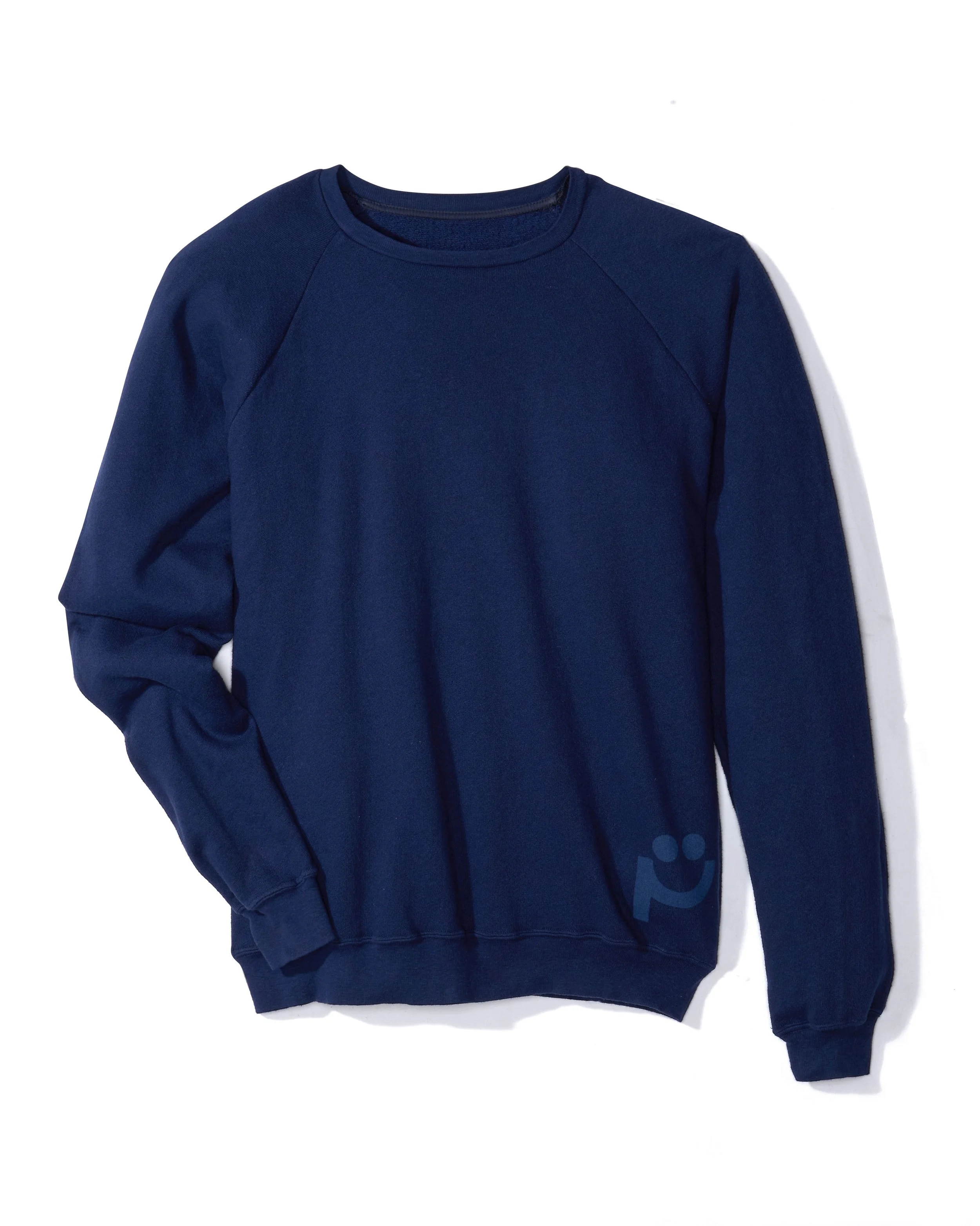
Directional light and controlled shadows reveal fabric texture without making the image feel heavy. © Rare Studio LA
3. The Composition Looks Accidental Instead of Designed
A good lay-flat feels intentional. A bad one feels like someone simply dropped the garment on the ground.
Common problems include:
Twisted sleeves
Crooked placement
Uneven spacing
Distorted proportions
Unbalanced framing
Clothing is highly sensitive visually—small composition errors immediately downgrade the photo.
What elevates it:
Aligning seams and hems carefully
Using guides to keep everything consistent
Positioning sleeves and collars in natural, flattering ways
Maintaining consistent cropping within a collection
Precision is what makes a flat image feel expensive.
4. The Background Isn’t Truly Neutral or Clean
Lay-flat backgrounds accumulate everything: dust, lint, handling marks, texture inconsistencies, uneven tones.
Even a slightly dirty backdrop instantly cheapens the photo.
What elevates it:
Using clean, well-maintained surfaces
Keeping color temperature consistent across the set
Subtle retouching to remove marks without flattening the image
Avoiding shadows or gradients caused by poor lighting
A clean, neutral background is one of the fastest ways to signal brand quality.
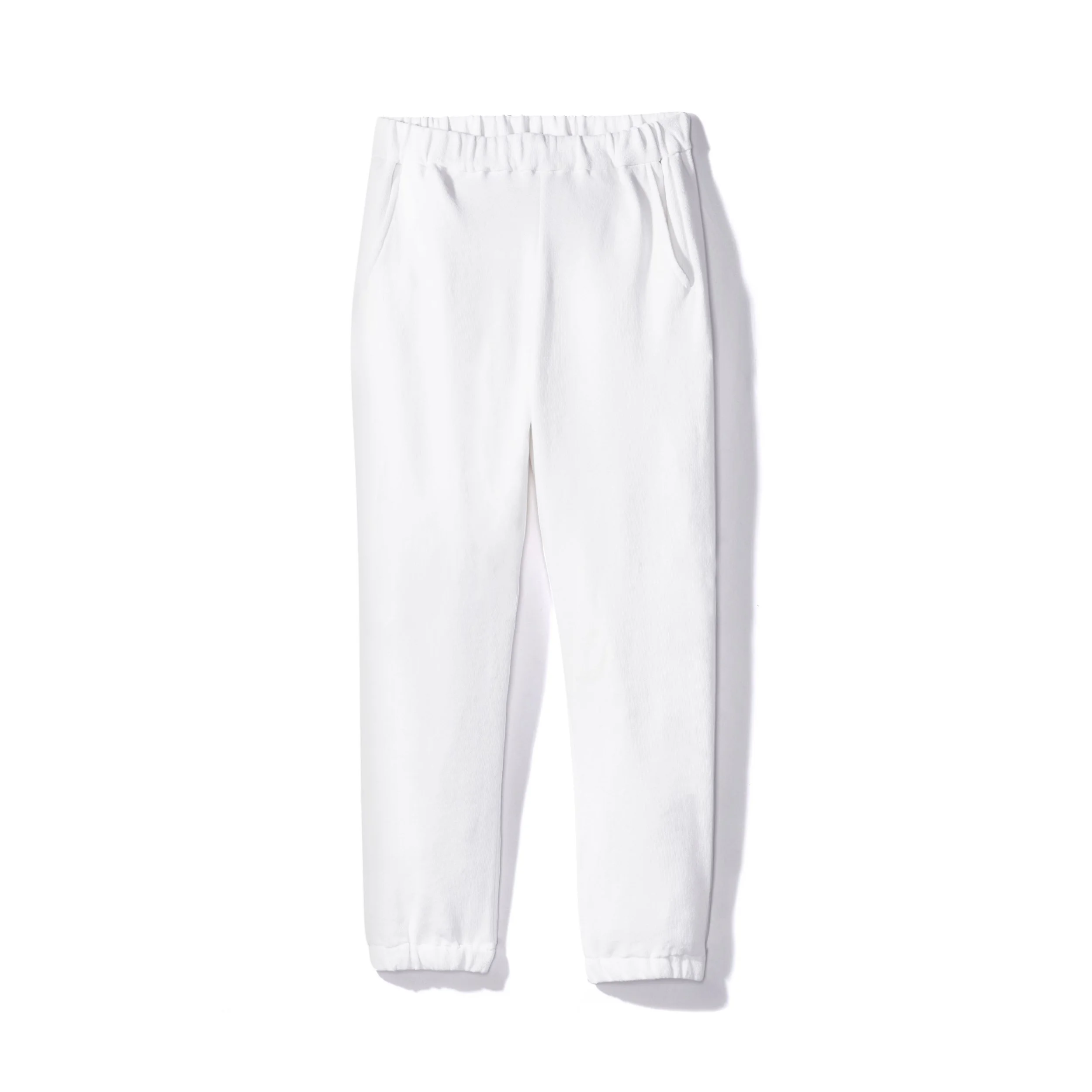
Clean backgrounds and intentional composition are what separate premium lay-flats from forgettable ones. © Rare Studio LA
5. The Editing Is Overdone or Inconsistent
Retouching should refine a lay-flat—not completely reinvent it.
But many brands over-edit: blown-out whites, over-smoothing, warped seams, inconsistent colors, or removing shadows entirely. All of this makes the final image feel artificial or low-end.
What elevates it:
Subtle, clean retouching that preserves fabric texture
Accurate color representation
Consistent exposure and contrast across the collection
Maintaining natural shadow structure
Good editing disappears. Bad editing is the only thing you see.
6. The Image Doesn’t Match Your Overall Visual System
Even a technically perfect lay-flat will look disconnected if it doesn’t match the rest of your brand’s visuals.
If your on-model shots, ecommerce images, Amazon listings, and social content feel like different worlds, customers pick up on it.
What elevates it:
A defined style for tone, contrast, lighting direction, and shadow depth
Matching aspect ratios and framing
A consistent system for future SKUs
Cohesion across flats, details, and on-model shots
Consistency is what transforms photography into brand identity.
So How Do You Make Lay-Flats Look Expensive?
It comes down to four fundamentals done extremely well:
Prepare the garment with intention
Use controlled, directional lighting
Compose precisely and consistently
Retouch with a light, accurate touch
Lay-flat photography exposes every mistake—but when done properly, it becomes one of the cleanest, most scalable ways to show your product line.
Need help making your lay-flats actually look like your brand?
Most clothing brands don’t need more complex photography—they just need the fundamentals done really well and really consistently. If your current photos feel flat or low-end, it’s usually a workflow issue, not a product issue.
At Rare Studio LA, we help brands build a repeatable system for clean, elevated lay-flat images that align with their visual identity as they grow.
You can check out our work at rarestudiola.com , and you can always browse our Google reviews if you want to hear from the teams we’ve worked with.